


Although the tablet is used by a significant portion of visitors to most sites today, it unfortunately seems to be largely ignored in terms of website optimization.
How to define a 'tablet'
Defining what a tablet is is becoming increasingly difficult. Not long ago, we could simply define a tablet as "a touch-sensitive mobile device with a screen larger than a smartphone, but also smaller than a desktop or laptop computer."
However, this definition does not accurately take into account recent developments in mobile technology. For example, devices like Microsoft's Surface and the iPad Pro now come equipped with desktop-sized screens and are called "detachables." Then there's the rise of 'phablets', which appear to be Centaur-like creatures that are considered a phone and a tablet at the same time.
With all these hybrids flooding the market, comparing the tablet to other device groups in terms of size isn't future-proof. Therefore, we simply define a tablet as "a touch-sensitive mobile device with a medium to large screen."
How do tablets compare to desktop and mobile?
Market share
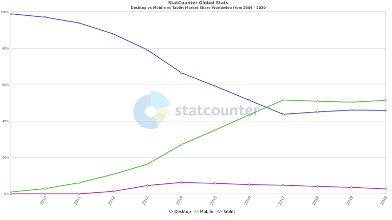
The market share of tablet users increased steadily until 2014 and has been slowly declining since then. The predictions about the future of the tablet are diverse. Some research states that the tablet is slowly becoming an increasingly serious competitor for the desktop and tablet computer. However, other studies point to the aforementioned downward trend over the years.
Conversion rates
Monetate Ecommerce's quarterly report shows conversion rates by device group. Their latest figures show that worldwide, traditional (desktop) devices have an average conversion rate of 3.30%, tablets 3.82% and mobile phones 1.99%.
As the report shows, conversion rates for tablets are similar to those of traditional devices. However, currently there are only a few good resources available on conversion optimization specifically for tablets, while they are plentiful for desktop optimization. If the tablet user is treated more seriously over time, user conversion rates on tablets may increase even further.
Data in Google Analytics
You can use Google Analytics to learn about the conversion rates of the tablet, mobile, and desktop users on your website. To do this, go to the report: Target group > Mobile > Overview.
Screen size
Modern tablets (which by our definition also include phablets and detachables) range in screen size from 600 x 1024 to 1024 x 1366 pixels. Please note that some devices may report higher screen sizes, but these are usually devices with a pixel density greater than 1.
Data in Google Analytics
If you're curious about the most popular tablet screen sizes for your website, head over to Google Analytics to find out. The data can be found in the report: Audience > Mobile > Devices > Primary dimension > Other > Screen resolutions.
However, keep in mind that the variety of tablet screen sizes varies widely. That's why, wherever possible, you should ensure that your website is optimized (or at least functions properly) on every screen resolution, from the smallest Apple Watch to the largest flat-screen TV.
Free and non-binding 1 hour session?
Gain insight into your challenges surrounding CRO
How do people use tablets
Location
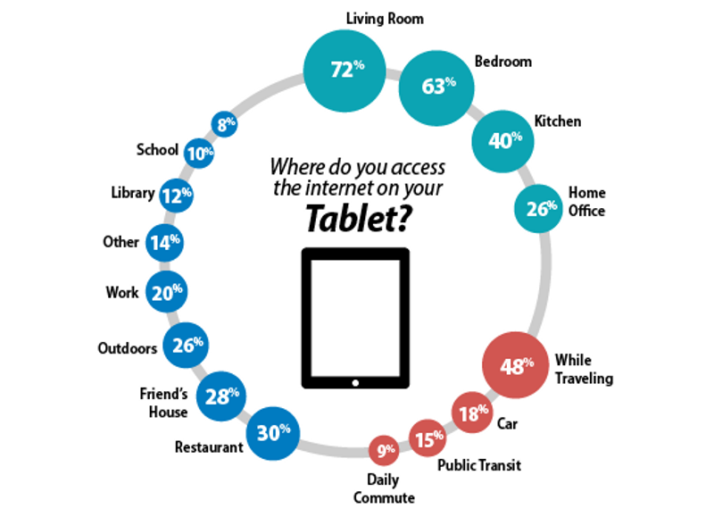
Tablet usage statistics provide a general insight into where people use tablets. For example, the data shows that most respondents use the tablet in their own home. At home, the living room is the most popular place to use the tablet (72%), followed by the bedroom (63%) and the kitchen (40%). Only the restaurant (30%) and the general category 'Travelling' (48%) come close to the percentage of tablet users at home.
Connection
When you combine the high level of WiFi presence in homes with the data on where tablets are most used, we can conclude that most tablet users (even those who have 3G, 4G or 5G tablets) visit websites primarily through a wifi connection.
Timing
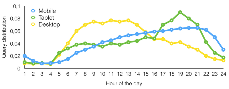
A few years ago, Microsoft researchers presented their findings from a study into user search behavior on mobile devices. As part of their research, they tracked which device group was used to access the search engine. As the image shows, tablet traffic remained fairly stable throughout the day, peaking around dinnertime before quickly plummeting. Comparing this to the data on desktop and mobile devices, it confirms previous findings that tablets are most often used at home, and more specifically in the living room, followed by the bedroom.
How to optimize a website for tablets
Responsive design
This movement has now conquered the internet. Around 2008, websites with responsive design began using media queries to adjust the appearance of their content based on the size of the screen it is being displayed on. Mobile visitors received a focused, single-column design optimized for a small screen. Desktop users, on the other hand, got a richer experience, best suited to many available pixels.
Desktop version
Unfortunately for tablet users, their tablet environment was neither fully understood nor exploited, and they often ended up with a scaled-up version of the mobile website instead. However, it seems that this was not the optimal solution for both visitors and website owners. After all, large parts of their screen were unused and potentially useful elements were hidden due to the mobile-based interface design. So if your organization isn't ready or willing to include tablets (of all sizes!) as a priority, make sure you're presenting tablet visitors with the desktop version of your website. Both an article from Google and a case study from VWO confirm that this is the best way to go for now.
Tools
Physical tablets
The most important tools in your toolbox should be physical versions of the most popular tablets that visitors use to browse your website. By testing your website on these devices, you can ensure that you are replicating your visitors' user experience as closely as possible.
Debugging remotely
If you are working on improving your website (or, for example, setting up an A/B test), it can often be useful to inspect elements live on your tablet. Using a technique called remote debugging, you can inspect elements on your physical tablets just as you would on your desktop computer.
Google Chrome Developer Console
The Google Chrome browser allows you to emulate a mobile or tablet view of your website. The developer console can be accessed via cmd-shift-c followed by cmd-shift-m (Mac) or F12 followed by ctrl-shift-m (PC). This Toggle Device Mode allows you to emulate a wide range of devices, including popular models of the iPad and various Android tablets.
User recordings
By viewing user recordings of your tablet visitors (with tools like Hotjar), you can see how they navigate your website. Can they use your navigation? Is the shopping cart well designed for mobile use?
Pratical tips for tablet sites
Fix CSS hover
A common problem for tablet users is having to double-tap a link to navigate to the page it links to. Unfortunately, most people don't know to double-tap and will abandon their efforts after the first 'failed' tap. The problem is described in this article. There it is described as related to the lack of a mouse to hover on a tablet, and Apple trying to solve this problem by making the first click on an element trigger the related :hover class in CSS.
Don't use Flash
In the past, Flash was one of the best options for adding animation or interaction to a website. Currently, Flash technology with solutions such as jQuery, HTML5 and CSS animations has declined in usage statistics. This change was further catalyzed by the release of the iPhone and iPad with the iOS operating system (which does not support Flash). Since the iPad still has about a 50% share of the tablet market, using Flash for every critical task will essentially keep 1/2 of your tablet visitors from converting.
Don't open new tabs
As outlined in this article on target="_ blank", there are a few good reasons to automatically open links in new tabs. In practice, most of the valid applications mentioned in the article can also be solved with inline popups, almost completely eliminating the need to open new tabs.

Test landscape and portrait
Websites displayed on tablets should be tested in both orientations: landscape and portrait. Because the number of pixels available in the screen width varies greatly between these orientations, websites may often have large white space or be cluttered. Please note that even the process of switching modes (flipping the tablet over) can cause problems on some websites, make sure this is not the case on yours.
Test all screen sizes
In addition to testing both orientations, make sure you test your website on all tablet screen sizes. Unfortunately, most websites settle for testing for only the most popular models from Apple or Samsung. While this may seem like an effective solution now, with the rate that new devices are being released, it will likely mean they will have to re-tweak or optimize their website again in the near future.
Test your menu
Getting your navigation right on a tablet can be difficult. It involves balancing your users' needs to quickly navigate to a page with the limited screen real estate available for a menu. As can be seen from the user interface of this Tablet U| | Navigation on Pinterest, there are plenty of ways to approach this. Whatever solution you choose, make sure you perform user testing and user recordings to see if tablet users can find and use your menu as intended.
Test at high pixel density
Many modern tablets have screens with a pixel density of more than 1. These screens are also called Retina screens. Because these screens can display images in sharper detail, they can also flag images that are not optimized for them. To make your product images look their best on a retina screen, you first need to test your website and improve it where possible. Also make sure you use SVG icons, for example, so that they look sharp at any resolution or pixel density.
Optimize your forms
Forms are an important part of your website. They serve as a gatekeeper between a visitor and a customer. When it comes to optimizing forms for tablets, the most important aspects to keep an eye on are autocorrect, HTML5 form types, and displaying form fields in a size large enough to tap.
Enlarge the size of your buttons
It can be much more difficult to accurately click on an element with a finger compared to a mouse. Therefore, it is advisable to increase the size of clickable elements on your website. This makes it easier for users on all devices to click or tap your buttons. The recommended size for clickable elements is at least 44 x 44 pixels, with bonus points for a good amount of white space around the elements.
Luke Wreblowski - Product Director at Google
"People interact with touch-based user interfaces with their fingers, so user interface controls must be large enough to capture fingertip actions without frustrating users with erroneous actions and small targets."

Enlarge your font size
To keep text readable for all visitors, the font size must be large enough. This is especially true for mobile devices, which tend to have smaller screens than desktop monitors or laptop screens. Therefore, when developing your website (or using media queries to optimize it for tablets), make sure to choose a font size of 16 pixels or more. This ensures good readability and will therefore most likely contribute positively to your conversion rate.
Add 'E-mail shopping cart'
Converting visitors on mobile devices can still be a difficult task, which could explain the lower conversion rates on these devices. Therefore, it may be wise to add features such as 'Email shopping cart' to your checkout. This allows visitors who are willing, but not easily able, to purchase their items to do so on the device of their choice (which is often the desktop computer).
Adjust meta tags
Several meta tags are available to further optimize the mobile experience. For example, there is the 'viewport' meta tag that controls aspects such as the width and initial scale of the screen. Other meta tags like "apple-touch-icon" and "apple-mobile-web-app-status-bar-style" let you further customize the iPad experience.
Conclusion
Even though tablets have the lowest display share of desktop and mobile devices, they still provide an important opportunity for conversion optimization. By following the above guidelines and best practices, tablets can become an even more important driver of conversions on your website or online store.
About the author

Theo van der Zee (MSc, Psychology) has been building and optimizing websites and web shops for more than 20 years. As a freelance conversion specialist, he helps companies to improve their websites based on research and experiments.