


An often overlooked part of website optimization is text formatting. However, the importance of this is clearly related to a simple principle: if visitors cannot or do not want to read a piece of text, then those visitors are unlikely to convert.
In this article we therefore explain how you can increase the conversion rate on your website by thinking about six principles related to the fonts and readability of the text on your website.
Font family
The University of Michigan has studied the use of different fonts. This showed that an assignment written in a readable font was considered easier than an assignment in a difficult-to-read font. Another result was that people saw the difficult-to-read assignments as something that would take more time than the easy-to-read assignments. In addition, numerous studies have shown that people are more likely to perform certain behaviors when they require less effort. It also appears that the use of a readable font can contribute to the extent to which websites can convince visitors and entice them to take action (such as purchasing a product).
Serif or sans serif
Serif fonts have thin horizontal lines at the end of the letter (colored red in the image). Sans serif fonts do not have these lines. The function of these crossbars was to guide the eyes between successive letters. Although numerous studies have been conducted over the past century on the difference in legibility between serif and sans-serif fonts (both analog and online), they show no clear distinction. Although the general opinion tends to be that sans-serif fonts should be used on the Internet, this opinion does not appear to be based on thorough research. For this reason it is not yet possible to provide a well-founded best practice. The best advice is therefore to see whether the choice of a particular font increases or decreases the conversion.

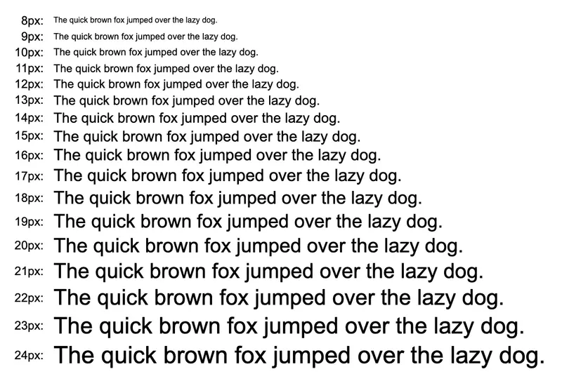
Font size
In addition to the selected font, the font size used is important for readability. The famous article "16 Pixels For Body Copy. Anything Less Is A Costly Mistake" states that every site should use a font size of 16 pixels or larger for the body text. This statement is supported by statistics such as that only about fifty percent of light passes through the retina of a 40-year-old compared to a 20-year-old. For 60-year-olds this is only about twenty percent. This means that the older a visitor to your website is, the more difficult it will be for him or her to read the (small) letters on it. As mentioned earlier, text that visitors cannot or do not want to read is unlikely to convert. Keep this in mind when choosing the font size for your website.
Free and non-binding 1 hour session?
Gain insight into your challenges surrounding CRO
Visual limitations
WHO data shows that approximately 3-5% of people worldwide are visually impaired. These people will likely have even more difficulty (or be completely unable) to read small text on a website.
Mobile devices
Due to the rise of mobile devices such as smartphones and tablets, it is more important than ever to think about the font size of your website. Using techniques such as media queries, you can dynamically adjust the font size of your website based on the available screen width. When this technique is applied to the entire website, a responsive website can be built that also takes into account, for example, the size of headlines and the number of words per line. However, when mobile users are simply shown the desktop website, they are forced to zoom in on the text to read it. With this extra action, visitors quickly lose the overview of the website. Thoughts like "Was that order button on the left or right side of the website?" are detrimental to the conversion rate.
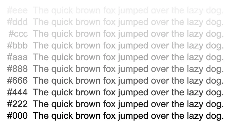
Contrast
Text contrast refers to the difference in color between the text and the background. In the past, designers liked to place white text on a light gray background, or in extreme cases even red text on a green background. Although fortunately these times are largely a thing of the past, it does not hurt to emphasize once again that a good contrast between the text and the background is very important for readability (and therefore the possibility of a conversion).
Benchmark
In the so-called '100% Easy-2-Read Standard', experts state that good contrast is of great importance, but also that too great a contrast (black on white) is not recommended. They provide a benchmark "#333 on #FFF", which represents dark gray letters on a white background.
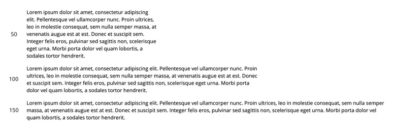
Line length
In addition to previously mentioned factors such as font, font size and contrast, there is a lesser-known factor that also contributes to the readability of a text, namely line length. This factor refers to the number of characters (or sometimes words) each horizontal line contains. There are two possible problems with line length, lines that are too long or lines that are too short. Long lines require the eyes to travel a long distance to the left side of the screen after reading a line, which requires a lot of mental effort. With lines that are too short, on the other hand, you have to jump your eyes back and forth too often after the end of a line, which is also not pleasant to read.
Rule of thumb
As a rule of thumb, use 50-75 characters (including spaces) per line. This rule of thumb is proposed by usability institute Baymard. Of course, when determining the correct line length, remember that there are now hundreds of different screen sizes, all of which have their own optimal line length. Using the above-mentioned media queries can be a great solution to this problem. To determine the optimal line length (and text size and line spacing), the Golden Ratio Typography Calculator can be used.
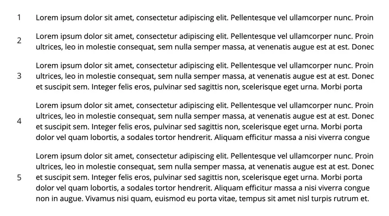
Paragraph length
As a penultimate point, we discuss the structure of paragraphs. In an article on how you can contribute to increased conversion, Content Marketing Institute suggests that an optimal paragraph has 4 to 5 line heights. This advice is given to avoid long paragraphs that are intimidating to look at. It is stated that if the text were to be in one paragraph, one should first explain a complex idea in a short introductory paragraph, which is then followed by another paragraph that further explores the concept.
Distance between paragraphs
Please note that there should also be appropriate spacing between paragraphs. As a rule of thumb, the distance between the end of one paragraph and the beginning of another paragraph should be large enough to notice, but small enough to preserve the text as a whole. If you view the page from a distance (where you can't read the actual text), you should still be able to identify which parts belong together. If the paragraphs seem like separate entities on their own, the distance is too great.
Scanning
In addition to the readability of the text, scannability is also important. The main reason for this is that research by the Nielsen Norman Group shows that internet users only read 20-28% of the text on a website. Various parts of a website can contribute to better readability of the text.
Headings
Make sure that the main heading of the text (usually the title) gives a clear idea of the content of the text. Because the title is the first indication of the content of the text, it should draw the visitor in and encourage them to read the text.
Sub headings
In addition to a main heading, subheadings should also be used. These headings (which are listed according to their relative importance) should be placed above each new paragraph. This way, visitors don't have to read the entire paragraph to know what it's about. Good subheadings allow visitors to scan a text to see if it contains the information they are looking for.
Lists
- Quick overview of existing information
- Clear structure
- Shown without unnecessary words
Bold and italics
Using words or phrases in bold or italics makes these parts easy to see, which greatly increases the scannability of the text. Please note that this should be used sparingly. Be sure to avoid underlined text, because visitors will immediately associate this with a link to another page.
Conclusion
The above six factors will significantly improve the readability and reliability of the text on a website. Since a visitor who cannot or does not want to read a text will probably not convert, it is important to take this into account. In summary, this means:
- Choose a suitable font
- With readable font size
- Sufficient contrast
- The correct length of lines
- Well-sized paragraphs
- Easily scannable
You can only determine which values are optimal for increasing conversion on your website through user testing or A/B testing.
About the author

Theo van der Zee (MSc, Psychology) has been building and optimizing websites and web shops for more than 20 years. As a freelance conversion specialist, he helps companies to improve their websites based on research and experiments.


