Almost every webshop uses product pages. This page type is also called 'product page', 'product detail page', or 'PDP' for short. The primary purpose of this page is to show visitors details about a particular product. Visitors often have the opportunity to view various photos of the products, read product reviews, and investigate the properties of the products.
Product pages are often used as landing pages for advertisements on Google or social media. However, you can also reach this type of page from a category page, for example. When you want to optimize a product page, you need to know what is possible. Which components do other web shops use on a product page? Are the solutions currently being used in line with best practices? What are alternative options to try?
Photos
Introduction
Just like in a physical store, people want to see what products look like. Photos are by far the most commonly used form for this at the moment. Which photos are shown partly determines to what extent the product will sell well or poorly. Showing good photos can also contribute to fewer products being returned.
Best practices
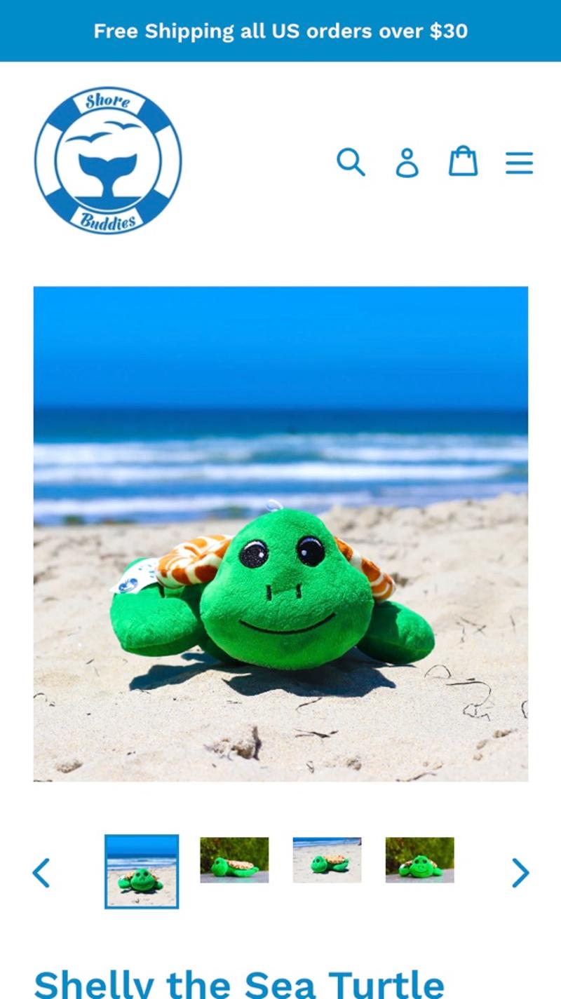
Most web shops choose to show one photo in large format. Thumbnails of small photos are then usually shown next to or below. When such a thumbnail is clicked, this photo will be shown instead of the large photo. Often, at least one free-standing photo is shown in which only the product is visible, one photo where the product is used, and one photo in which the product is zoomed in on an important detail. For example, in the photo in which the product is used, you can think of a model wearing the garment.
Measuring
Especially on mobile devices, it is important to gain insight into which photos are viewed. In some cases, only one photo is initially visible and a visitor must swipe to view the rest. In other cases, the thumbnails are often so small that you can barely see anything in them. Especially if you are considering running an ab test in which photos play a role, it helps to know more about this.
Alternatives
An increasingly popular alternative to product photos are videos of the product. Such videos show the product in motion, which can give visitors a much better idea of its properties. When using product videos, keep in mind that they have as little negative impact as possible on the loading time and therefore the sustainability of the product page.
Validating
Almost all popular validation methods can be used for this element. Good CRO advice can help you make a choice here. You can of course think of A/B testing, but user testing or visitor behavior analysis are also good options.
Personalization
Whether or not to show clothing on a model is an issue that arises in almost every fashion webshop. Based on A/B testing and subsequent segmentation, photos on a model may be chosen for certain groups of visitors, while a free-standing photo is shown for other visitors. A more advanced personalization could be to, for example, show garments on a model who has approximately the same body measurements as the visitor. This gives him or her a much better idea of how the garment would fit. In the future, photos generated with artificial intelligence (AI) may also be used.
Examples
- Shore Buddies: Here they use the most common design, namely a large image with a few thumbnails underneath. Because this design is so widely used, it is intuitive for visitors and therefore user-friendly.
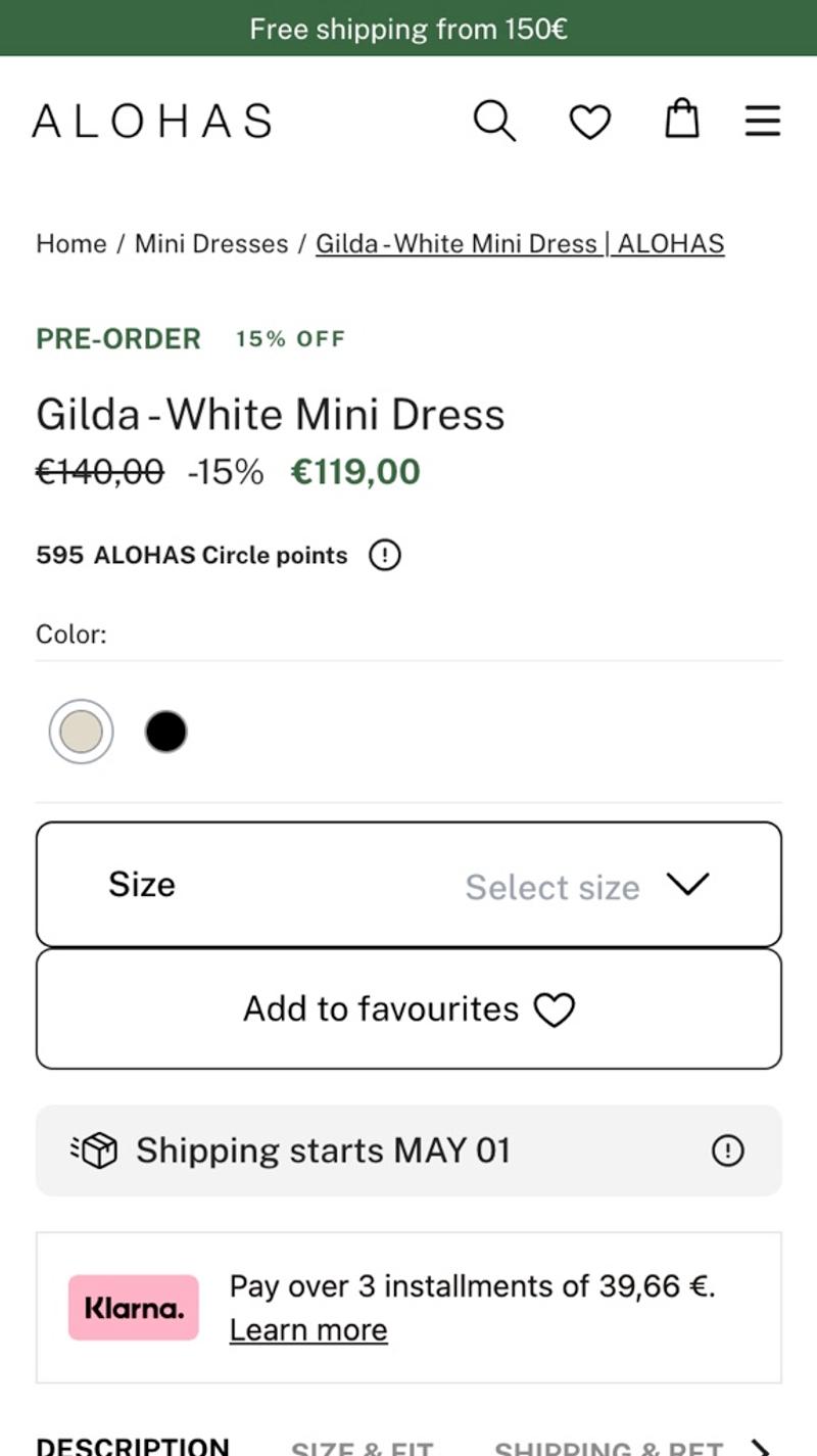
- Alohas: This webshop only shows one photo at a time. The disadvantage of this is that you force visitors to swipe to view other images. An advantage, however, is that attention is not distracted by thumbnails. This can be a suitable solution on mobile screens, especially for web shops that work with portrait photos.
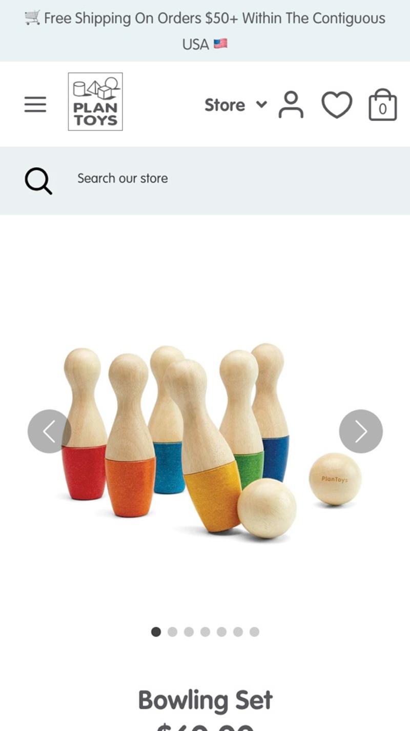
- Plan Toys: On this product page they use an image slider. This is clearly visible by the dots under the large image. Although the dots give an idea of how many photos there are, you cannot 'look ahead' as a user. They do have the advantage that they do not distract from the big picture.
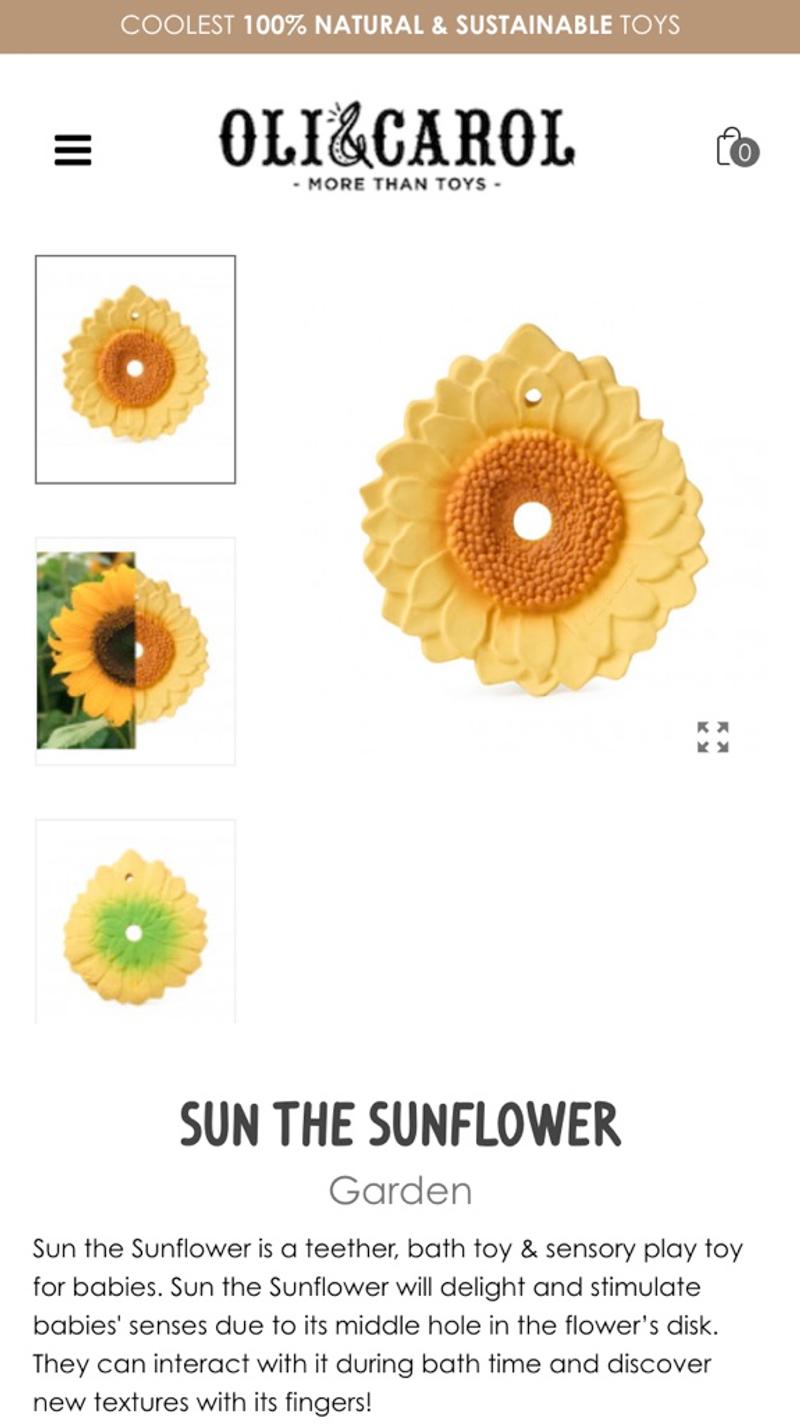
- Oli & Carol: On desktop screens, many web shops choose to show the thumbnails on the left side of the large photo. This webshop also opts for this on mobile screen resolutions. Personally, I think the large thumbnails and unusual layout look a bit untidy, especially compared to the more conventional layouts discussed above.
Free and non-binding 1 hour session?
Gain insight into your challenges surrounding CRO
Properties
Introduction
Each product has unique properties. By clearly displaying this on the product page you help the visitor to determine whether this is the right product for them. Many web shops choose to show both a textual description and a list of features.
Best practices
Especially when the products on the online store have many different properties, it can be helpful to display these in a table, for example, and/or to offer the option to compare products at the same time. Showing icons or labels can also make the search process easier for visitors in many online stores. In many cases, product reviews can also help to add additional information. For example, consider an indication of whether the size is 'too small', 'just right', or 'too big'.
Measuring
In many cases the properties are displayed in a way that is not interactive. This makes it difficult to measure the extent to which visitors are satisfied with the design. In some cases, however, a so-called accordion is used. You could save the unfolding of the different 'parts' as micro conversions. You can also use measuring points in the webshop to track how many visitors open the size chart and to what extent this contributes positively to the conversion rate.
Alternatives
Properties are a critical element on a product page, which means they cannot actually be replaced. As part of product page optimization, you can investigate in which form the properties can best be displayed on the page.
Validating
Because there is generally little interaction with the properties, many validation options are eliminated. A method that may be suitable is user testing because you not only see what the user does, but also hear what he or she thinks.
Personalization
If it becomes clear that a visitor always reads the same information (for example because the slider in the accordion is opened), this information could be shown more prominently. This way, the visitor has faster access to the necessary information, which immediately increases the chance of a conversion.
Examples
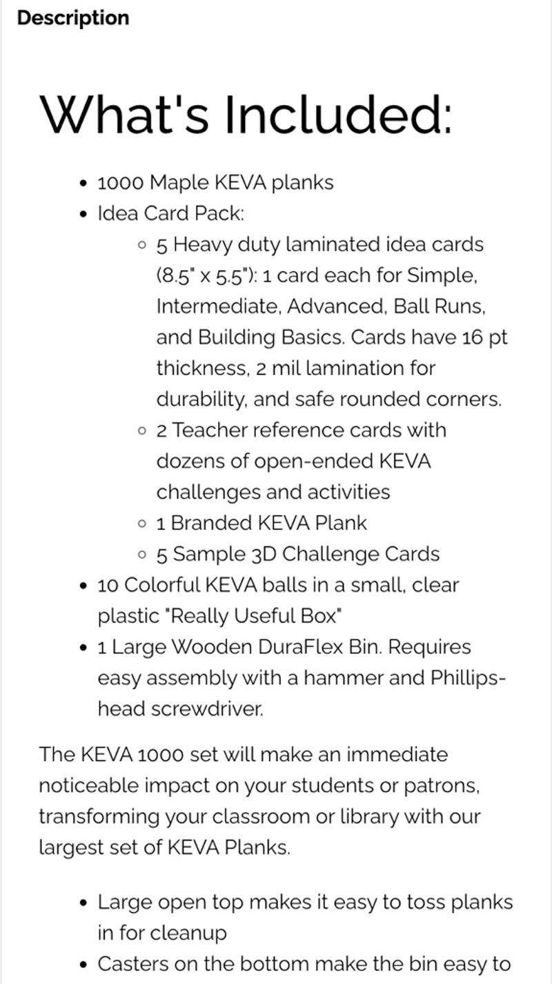
- Keva planks: The properties are shown here as text. Although neatly designed lists are used, I personally find it a bit too much information to easily process in this way.
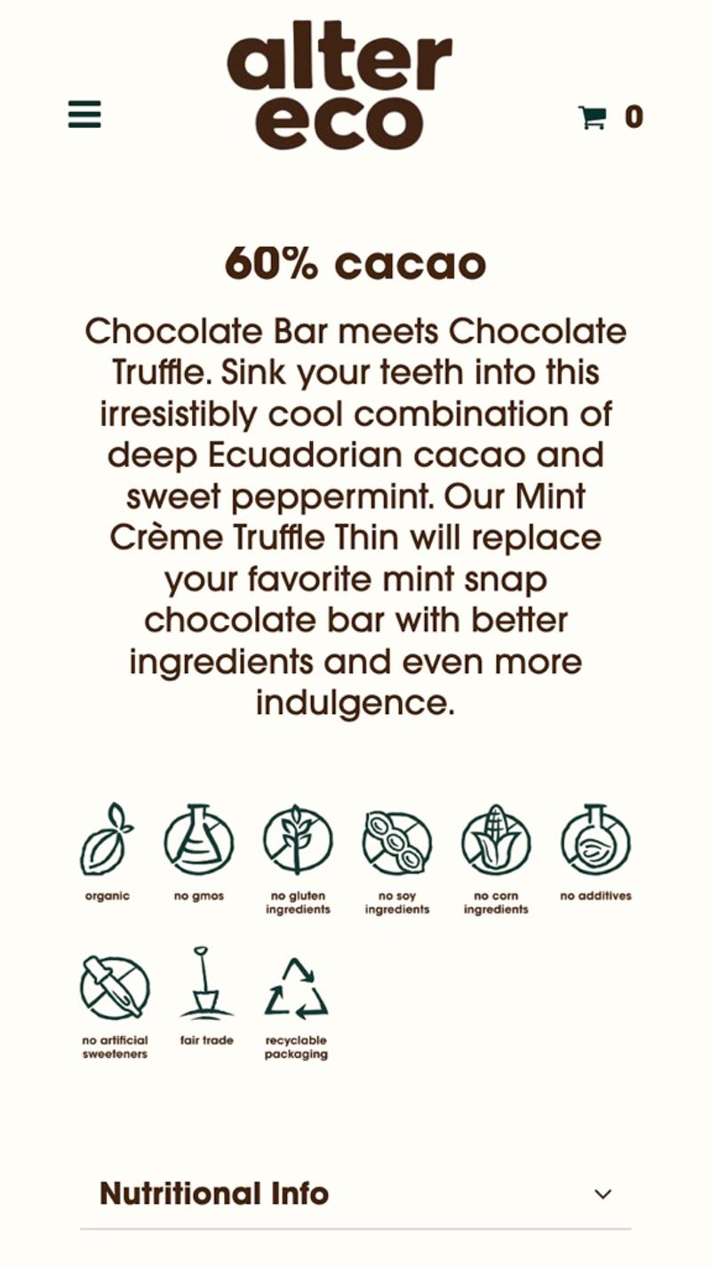
- Alter eco: This online store mainly uses icons. This can be an effective method, especially for online stores in the food industry. Unfortunately, the design does not seem to have given enough thought to small mobile screens, causing the icons to be small.
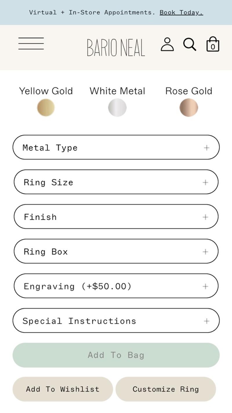
- Bario Neal: Here we work with a so-called accordion to visually divide the properties. This way, visitors can easily take in more information per section and make a choice.
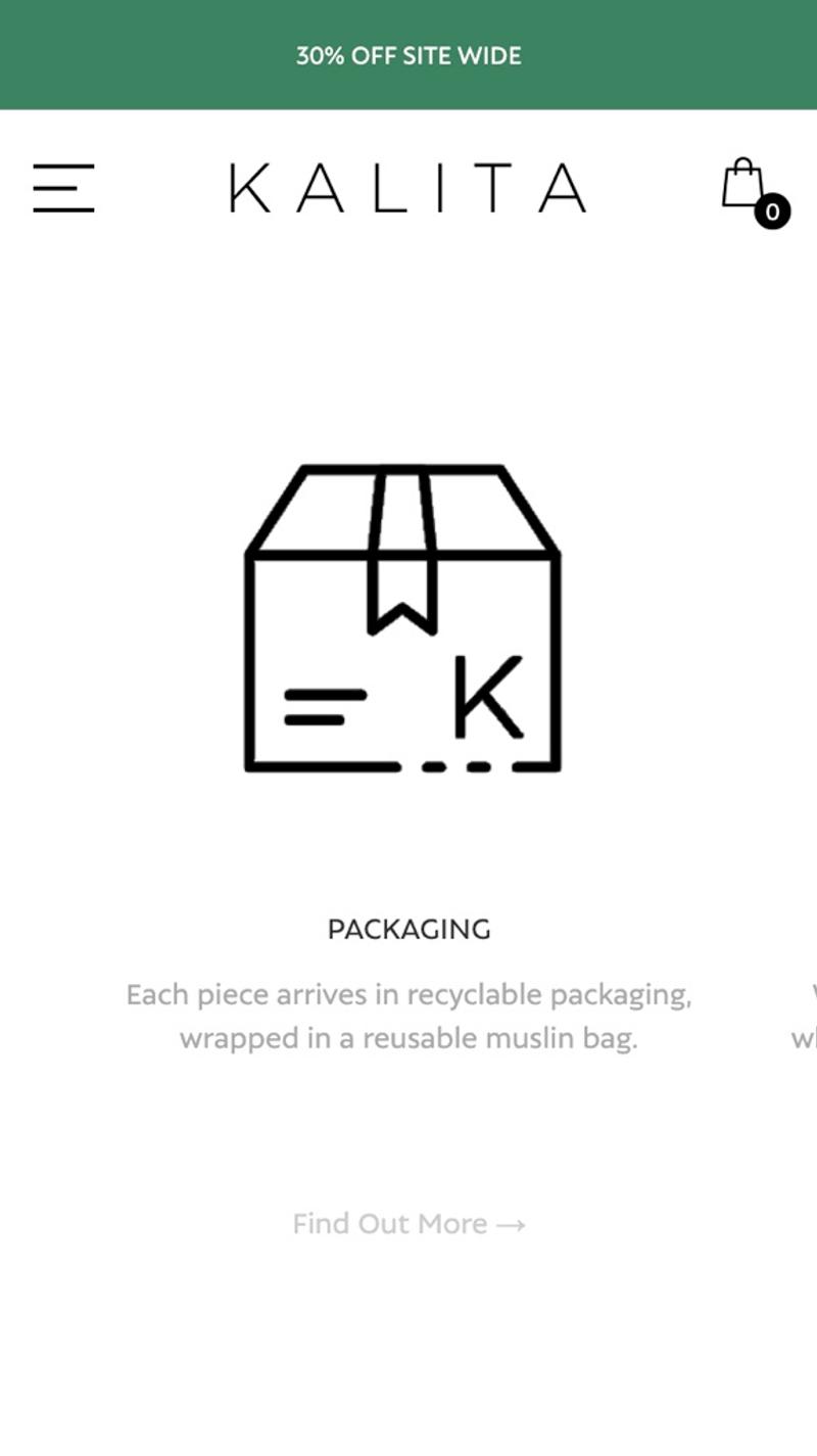
- Kalita: Instead of dividing the information vertically, this online store chooses to do this horizontally. Personally, I find this a very clumsy design, because as a visitor you cannot see the different parts at a glance, but have to swipe them one by one.
Price
Introduction
The price is an indispensable part of the product page. It is therefore important to pay sufficient attention to this part.
Best practices
Initially just show the price with a euro sign or dollar sign. Research shows that there is no strong evidence that hiding leads to better results. Of course, hiding can be tried at a later time as an A/B test, but keep in mind that you need large volumes of conversions for this. Also make sure that the price is shown in a clearly legible font. However, if visitors cannot read the price properly, this will probably lead to fewer conversions. Finally, it is advisable to set the price close to the CTA button. That way, people can see these two things at the same time, without having to look back and forth from the price to the button and back.
"However, large preregistered studies that control for commonly identified biases in the analysis of data and reporting of results failed to show a robust mean effect of the money primes."
Measuring
Because you cannot click on a price, it is difficult to measure interactions. As a kind of proxy, you could look at how often a product is added to the shopping cart. Because this happens much more often than a product is actually purchased, you can often observe significant differences even with lower visitor numbers.
Alternatives
As part of optimizing a product page, you can also consider other options instead of one price that you have to pay in advance. For example, there are web shops that offer to pay in parts (also called installments). This way you reduce the initial costs of purchase, which may result in more visitors being interested. There are also parties that work with subscriptions instead of a one-off price. If you choose this, you pay a fixed amount every month and you will always receive the item you want. This can be useful for products such as food & drinks or personal care.
Validating
Validating prices is known to be very difficult. For example, it is not actually possible to test this with front-end A/B testing tools (because you can adjust the price visually, but the visitor still pays the regular price). In theory you could send out a survey asking visitors what they think about other prices, but in many cases you will run into the value-action gap. Finally, you can think of so-called quasi-experiments where, for example, you show a certain price in a structured manner one day and a different one the next. Vista calls this time-split testing within their optimization program and uses this for their company.
Personalization
A relatively simple way to personalize prices is to work with discount coupons. You can then share this via a newsletter or social media, for example, so that one visitor will pay a different price than another.
Examples
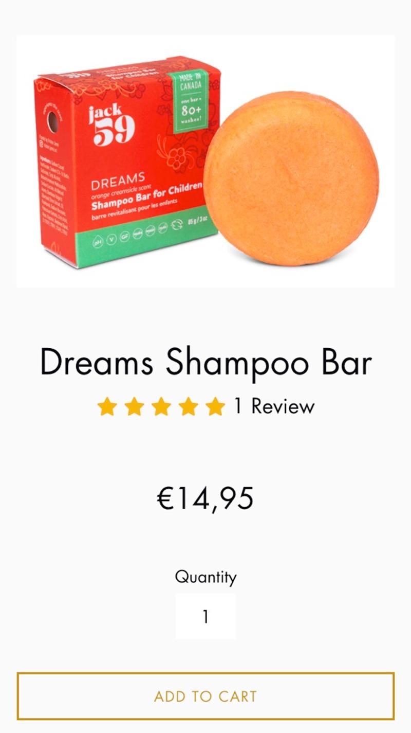
- Jack59: The most standard method for displaying a price is used here. An amount, with € sign, clearly visible, easy to read.
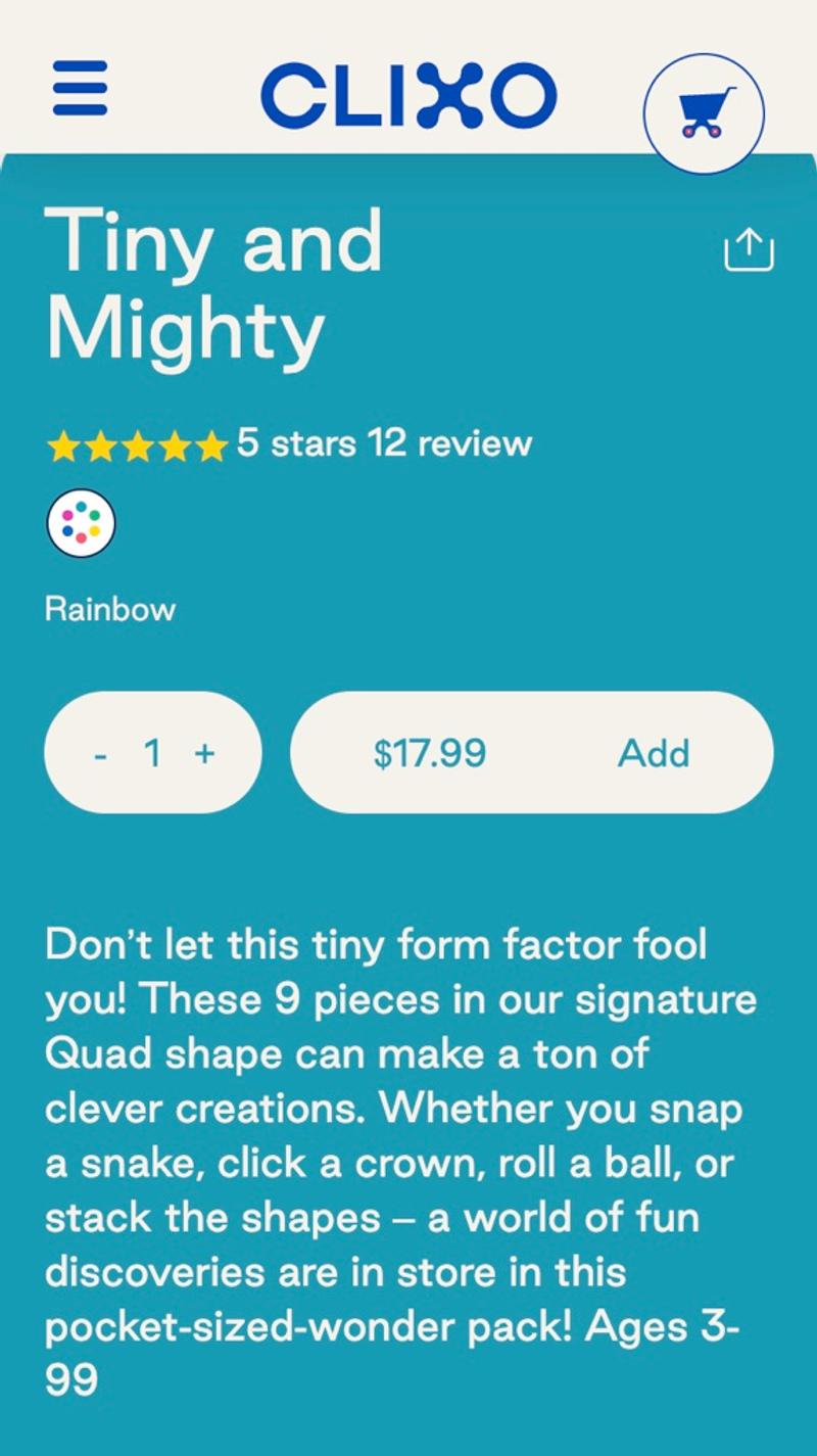
- Clixo: Instead of showing the price separately from the button, these aspects are combined in this webshop. This can be a suitable solution, especially when a large percentage of visitors opt for a larger number of products at a time.
- Alohas: In this example you can see how discounts are handled. In this case, it is chosen to show both the old price (with a line through it) and the new price and the discount.
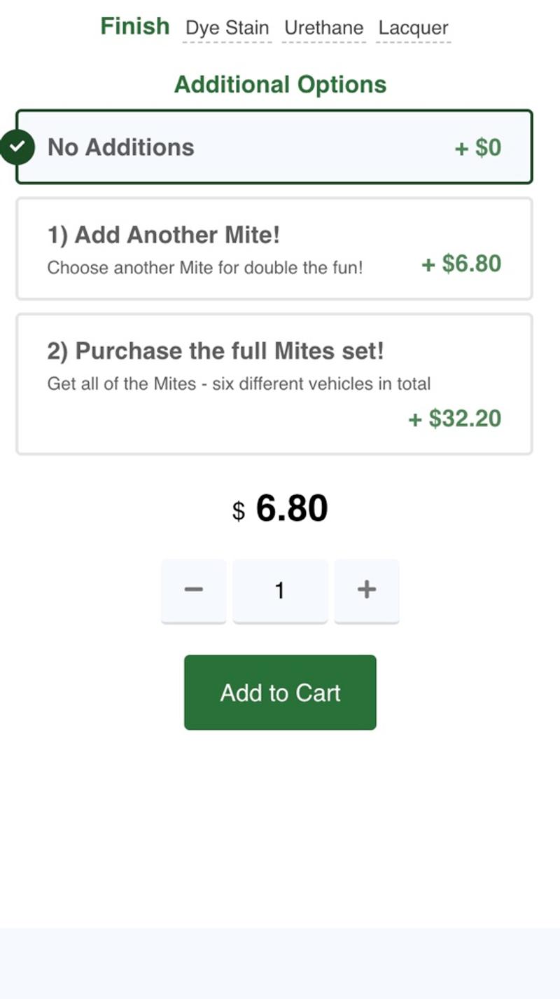
- Maple Landmark: In this webshop, up-sells are shown directly on the product page. As a visitor you can choose to order a second item or go straight for the entire set. Especially if a discount were linked to this, this could be an interesting way to display the price.
Frequently asked questions
Introduction
Showing frequently asked questions (FAQ) is not super common on an ecommerce product page. However, depending on the industry and the products sold, it can be a very useful option to display. A large proportion of visitors who cannot find the answer to a question in the regular content will drop out. If a clear answer can be found in the frequently asked questions, this can ensure that they convert into customers.
Best practices
Some visitors will view many product pages, others only one. Try to take this into account when showing the frequently asked questions. Sometimes it is sufficient to show a few generic frequently asked questions on all product pages. However, in other cases it can be effective to display product-specific FAQs. Although this can be a lot of work, it can also lead to excellent results. Not only do you answer the exact question a visitor has, but you also provide a lot of unique content on the page that can help with SEO.
Measuring
Usually the frequently asked questions are shown in an accordion. Initially only the question is visible and you must click on it before the answer becomes visible. This model is ideal for determining which questions visitors have.
Alternatives
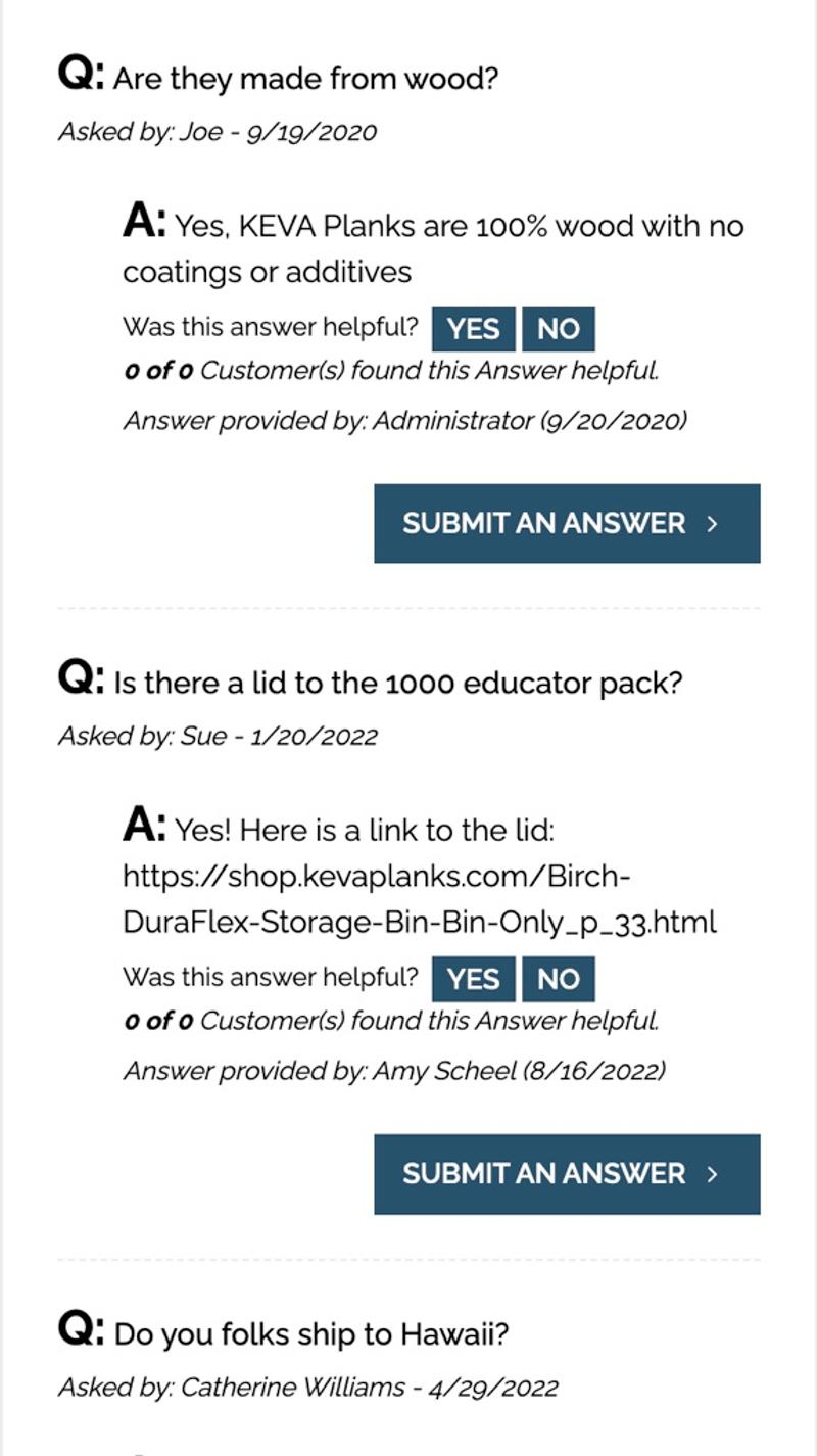
If you want to improve a product page, instead of predefined questions and answers, you can also consider a specific 'question and answer' (Q&A) option. You offer visitors the opportunity to ask a question on a product page and the answer is displayed directly below. You could also consider a combination of predetermined questions and this option.
Validating
One of the best options to validate changes to this element is probably through customer service. If they keep track of which topics they receive questions about, they may see a difference when the FAQ has been adjusted.
Personalization
For some visitors, personalization in the form of a chatbot may work better than an FAQ block. First try to validate which groups this concerns, or consider offering both options.
Examples
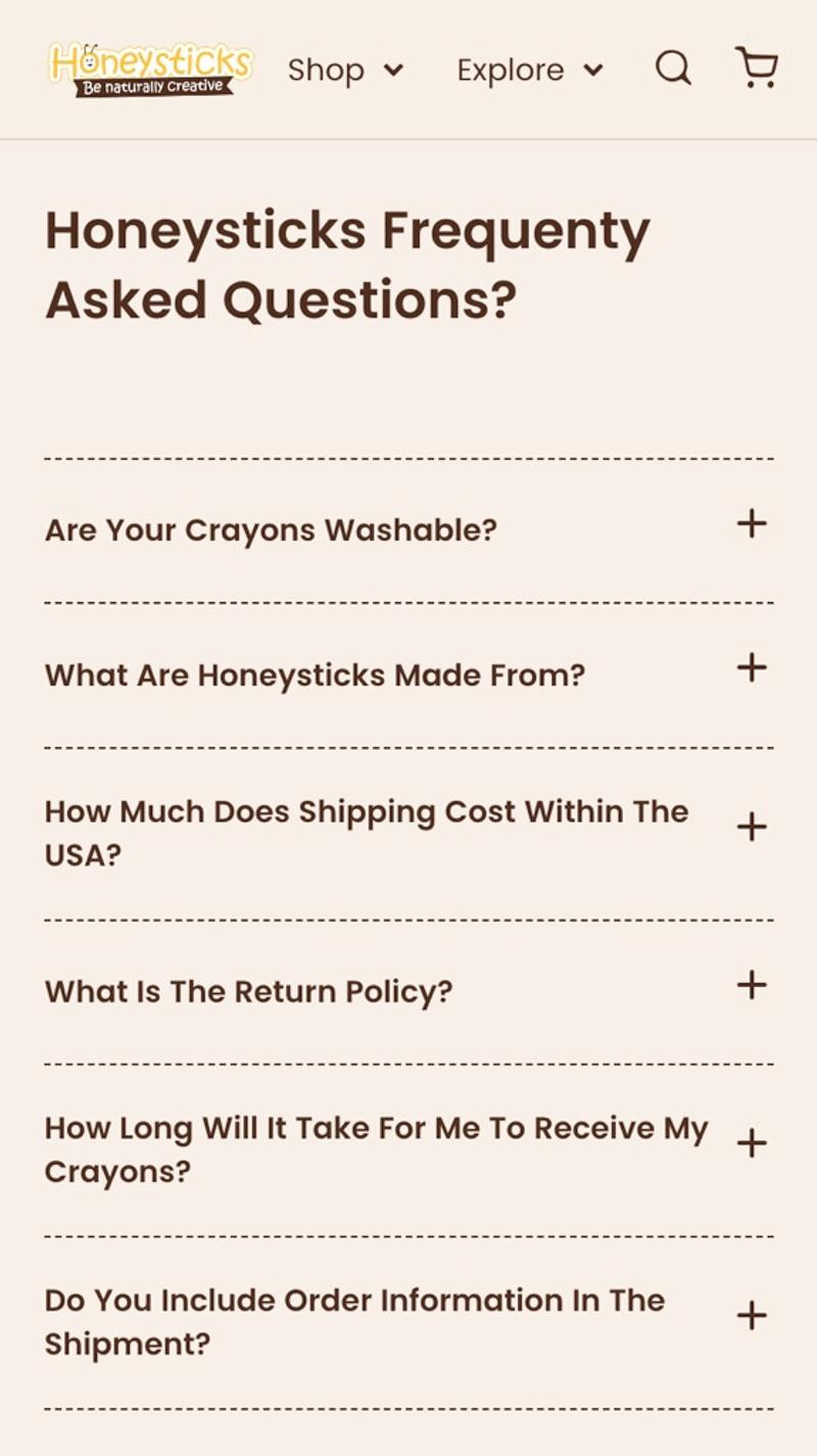
- Honeysticks: Here the frequently asked questions are initially only shown closed. When a visitor clicks on a question or on the +, the answer becomes visible.
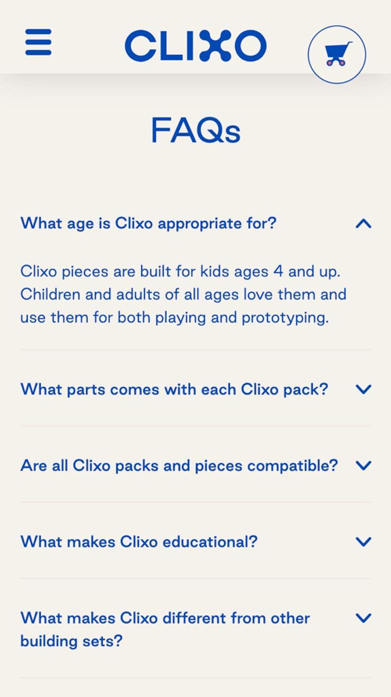
- Clixo: On this website, instead of a + and a -, an up and down arrow is used. The first answer is also immediately shown expanded. This has the advantage that the most frequently asked question is likely to be answered without the need for an interaction. Visitors are also likely to understand more quickly how this element works.
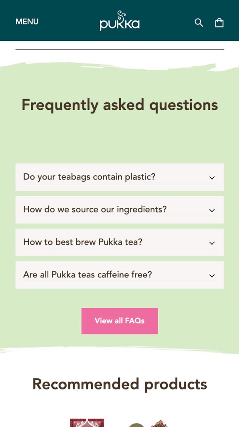
- Pukka: In addition to a small list of frequently asked questions, this webshop also shows a button to the knowledge base where answers to many more questions can be found.
- Keva planks: Instead of the generic frequently asked questions, a question and answer format has been chosen here. This makes it visible which specific questions visitors have asked and the answers are shown below. By using thumbs, the ranking of the questions can also easily be determined.


