You can see the homepage as the front page of the website. This page is also called the 'main page', 'home page', or simply 'home'. The primary purpose of this page is to make it clear to visitors what can be found on this website. It can also provide an overview of what makes this website a better choice compared to other companies.
To optimize a homepage you need to have an idea of the possibilities. What parts are on it? To what extent do they comply with best practices? And what are alternatives that can be considered? This article will discuss common components on a homepage.
Value proposition
Introduction
The value proposition is a compact explanation of the value a customer will get from purchasing a product or service from this company. It helps visitors determine whether a particular website is relevant to them. It can also help a company distinguish itself from competitors.
Best practices
Make sure the value proposition is specific, focuses on the problem a visitor is trying to solve, and sets the company apart from competitors. Preferably use a maximum of one sentence of text. Furthermore, many companies choose to type a longer sentence of text in a smaller font that provides further explanation about the products or services. In some cases, one or more buttons are also shown with the value proposition that are intended to draw visitors deeper into the website.
Measuring
Visitors cannot click or tap on a value proposition. This makes it not possible to measure interactions with this element. A value proposition is also almost always visible above the fold, so scroll maps will report little unexpectedly about visibility. However, it can be insightful to ask visitors or customers to what extent they find the value proposition of the website strong and distinctive.
Alternatives
Replacing the value proposition with another element is almost impossible. However, there are options to replace the value proposition itself. You can of course think of a homepage optimization that conveys the current message more clearly, or even a different value proposition. For example, you could add an introductory video near the value proposition. In this way, the value proposition can possibly be clarified and explained.
Validating
Optimally, you want to validate a change in the value proposition with an A/B test. However, because most web shops still require a large number of pages before a conversion is made, this is not always realistic. An alternative may therefore be to use surveys. Existing customers or members of a panel are then asked to what extent they find the new value proposition specific, problem-solving and distinctive.
Personalization
In principle, the value that a company offers is unique to every visitor. You could also consider highlighting different or additional aspects of the value proposition based on the website or advertisement from which the visitor comes. It is also possible to adjust the value proposition based on previously viewed pages on the website. When a visitor returns, he or she will see a more relevant offer.
Examples
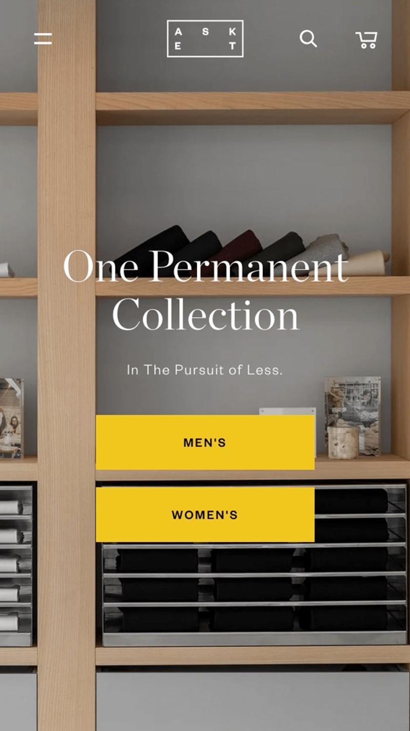
- Asket: With "One Permanent Collection" and the caption "In The Persuit of Less", Asket immediately sends a clear signal. You shouldn't go to them if you are looking for the latest fashion trends. However, for visitors who are looking for 'timeless' clothing (or are concerned with sustainability), this value proposition is probably appealing. Two clear buttons are immediately shown below the text so that visitors can navigate to the department that suits them.
- Blendily: This party chooses "Handmade, zero waste, botanical skincare" without a caption. This clear value proposition includes three aspects that make them special, namely that the product is handmade, the packaging can be recycled and that the product is made from plants. Each of these characteristics can be sufficiently appealing or distinctive to choose this party. A single "Shop Now" button should then entice convinced visitors to click deeper into the website.
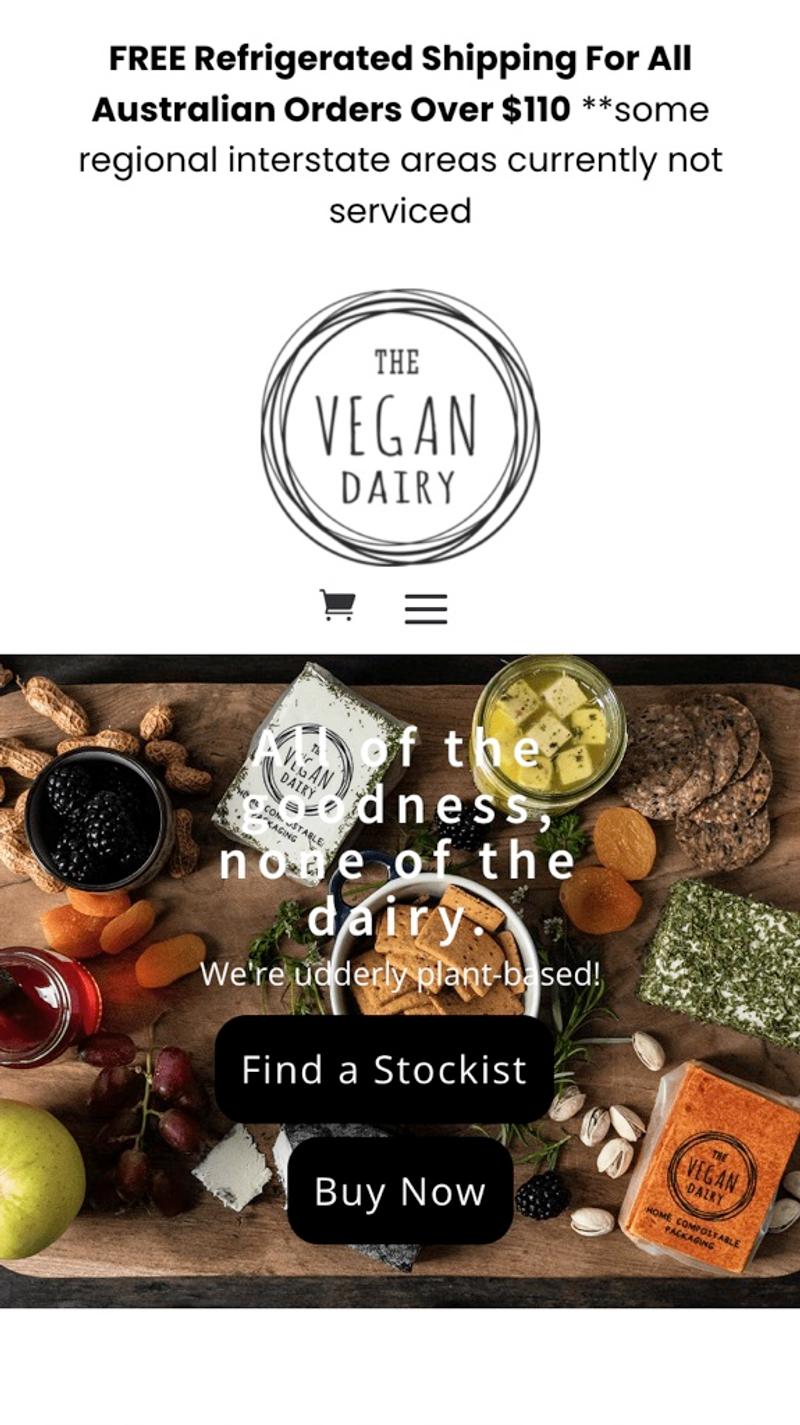
- The Vegan Dairy: The value proposition shown here is "All of the goodness, none of the dairy." with the caption "We're udderly plant-based". What is immediately striking, however, is how difficult the value proposition is to read due to the busy background. In this way, the message (which is indeed clear and appealing) is unfortunately difficult to convey on mobile devices.
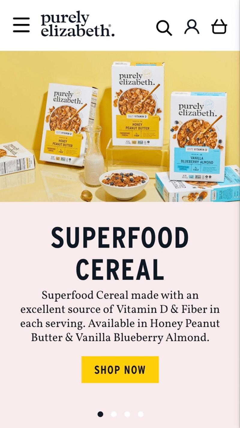
- Purily Elizabeth: A "Superfood cereal" is how this company describes its products. The caption explains why they see this product as a superfood. Because the photo and text are separated, the text is easy to read without looking boring. It is also noticeable that this value proposition is shown as the first slide of a carousel. However, because the slider does not move automatically, this is not disturbing.
Free and non-binding 1 hour session?
Gain insight into your challenges surrounding CRO
Image slider
Introduction
An image slider is an interactive element that is often shown at the top of the homepage of a website or webshop. It is a carousel of large images with usually text and sometimes buttons. Companies use image sliders to draw attention to new products or offers.
Best practices
The best practice is not to use an image slider. Various studies and statements are cited on Should I Use a Carousel that underline this. If you choose to display a carousel on the homepage, try to follow these guidelines:
- Show a maximum of three slides
- Use thumbnails
- Don't slide automatically
- Limit the size of the slider
- Take the loading time into account
Measuring
What is particularly important to measure properly with an image slider is which slides visitors actually see. If you have a slider with quite a few slides, there is a significant chance that some slides will hardly be viewed by visitors. It can also be valuable to gain good insight into how often visitors go deeper into the site via a button shown on a slide. When measuring these values, keep in mind that slides are regularly adjusted, and therefore slide #1 may not have shown the same image for the entire duration of the measurement.
Alternatives
A commonly used alternative to a slider is to show one or more static images. This can be one large image (comparable to a slide from the image slider), but also a grid of smaller images. When showing multiple images, keep in mind that mobile devices don't use too much horizontal space to display these images. In addition to images, you can also think about improving this part by using an introductory video in combination with a static value proposition as an alternative to an image slider.
Validating
As mentioned, the interaction with sliders can be measured quite well. Validating changes should be possible to a certain extent with the help of data analysis. Another alternative is to work with tools such as heat maps and session replays. You should then clearly see to what extent visitors interact with the slider and what actions they take afterwards.
Personalization
Theoretically, an image slider is a very suitable element for personalization. Based on the advertisement that visitors have clicked on or pages viewed, slides can then be shown that may be more relevant to visitors than the standard offer. Of course, it is important that the CMS or personalization tool is able to dynamically implement slider optimizations.
Examples
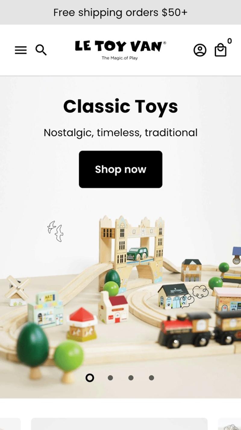
- Le Toy Van: Here a calm-looking slider is shown where the text and button are placed above the image. This way the text always remains easy to read. Because the slider only slides after user interaction, this slider is not distracting. In my opinion, this is a good example of how an image carousel can be used on mobile devices.
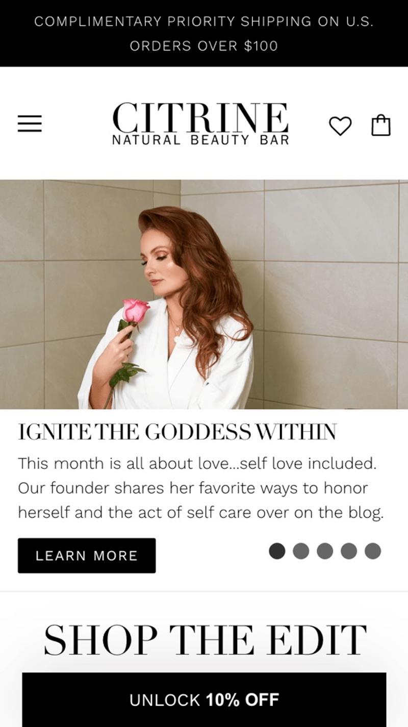
- Citrine: While most parties opt for a few words and a button on top of an image, that is not the case here. A large amount of text is shown on each 'slide'. Because they cleverly do not place the text over the image here, it remains excellently readable. However, the choice of five slides is a bit on the large side and the placement of the dots (not in the middle but on the side) is somewhat unusual and therefore less intuitive for visitors.
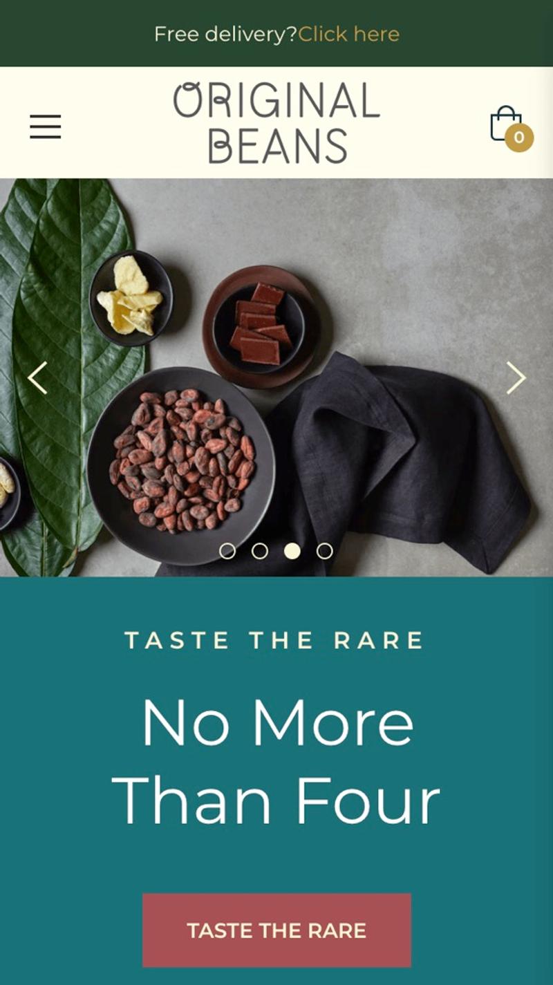
- Original Beans: This webshop uses a slider with visible arrows. These will probably increase interactions, but on the other hand they will also distract from the other parts of the page. Personally, on mobile, I would opt for the homepage optimization not to show arrows, so that the focus is more on the text and the button.
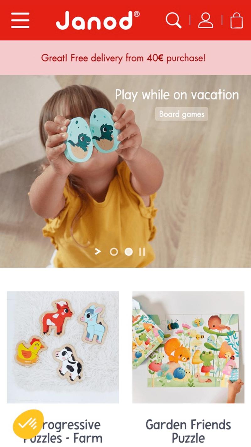
- Janod: This company chooses to display a play and pause button in addition to the usual dots. Because it is quite unusual to use these in image sliders, they may confuse visitors. Personally, I would leave the slider stationary and only move after an interaction.
Specific products
Introduction
Many online shops choose to show a few blocks of products on their homepage. These are often products that have a great chance of appealing to visitors. For example, consider products that are currently on sale or that are often sold.
Best practices
Try to avoid displaying "just some products" on the homepage, especially when you have a wide range in your webshop. If there are three different hammers on display while you also sell hundreds of other types of tools in addition to hammers, you may have missed the nail. By showing the products in the same product cards as on the category page, you can get visitors used to their design.
Measuring
Clicks on the various products can easily be measured in tools such as Google Analytics. Information can also be collected about the effectiveness of certain blocks on the homepage through heat maps, scroll maps, or session replays. Based on this information, it can, for example, be decided to display certain groups of products (sale, popular, featured, recently viewed) more prominently on the homepage of the website.
Alternatives
Of course, an alternative is to simply not show any products on the homepage. A surprisingly large group of web shops seems to opt for this. You can also improve the homepage by showing products in horizontal sliders instead of in product cards, for example. This can be an effective solution, especially on mobile devices. In that case, keep in mind that the most important products will be shown as the leftmost item, as this is the only item initially visible on mobile.
Validating
Web metrics and visitor behavior are probably the most effective way to validate changes to product blocks on the homepage. In most cases, there will not be enough conversions as a result of these blocks to give an A/B test sufficient statistical power. User testing also does not seem to be the best choice because clicking through to the products on the homepage is a fairly spontaneous action, while user testers often work in a more targeted manner.
Personalization
Product blocks are ideal for personalization. For example, you can show recently viewed items or products related to them. If visitors have products in their shopping cart, you can also use that information to apply further personalization. If visitors are logged in, the order history or wish list may also help to make the displayed products as relevant as possible.
Examples
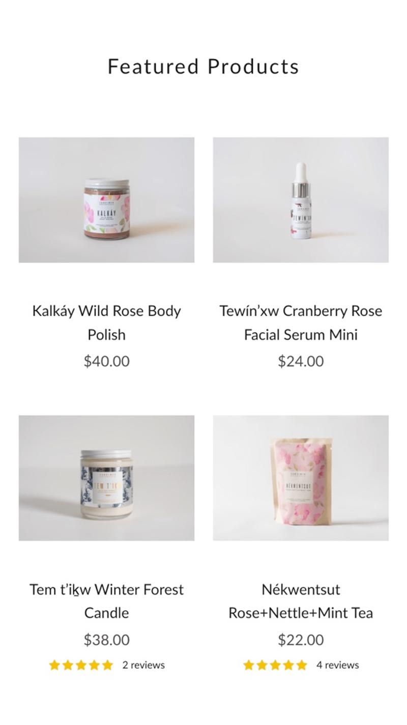
- Skwalwen: Here we choose to show some featured products on the homepage. The products are clearly displayed in pairs so that only a limited amount of vertical space is required. The score from product reviews is also immediately visible, which can convince visitors to click through.
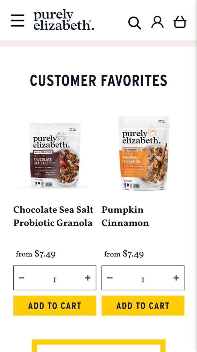
- Purely Elizabeth: Instead of just clicking through to the product page, this party chooses to make it possible to add products directly from the homepage to the shopping cart. The clever name 'Customer Favorites' may convince visitors of the social proof this radiates. Due to the relatively large space that such a product card takes up with this design, I think it is a smart choice to go for only two items.
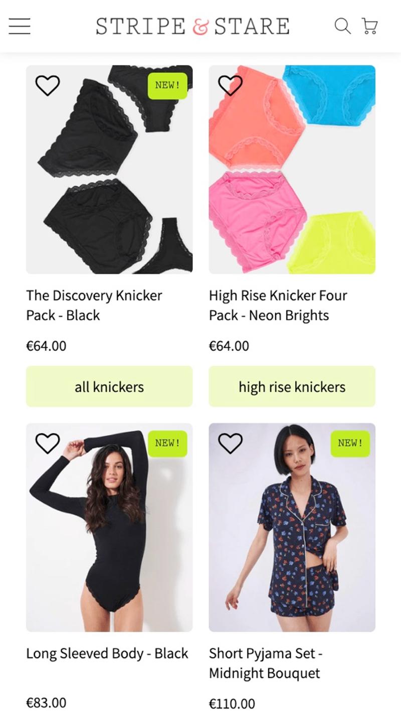
- Stripe & Stare: Complete product cards are shown in this webshop (including favorites heart and new label). They also combine this block directly with the option to click through to certain categories by using the buttons under the product cards. Personally, I don't think the design looks optimal this way, because it looks like that green element is the CTA button for adding that item.
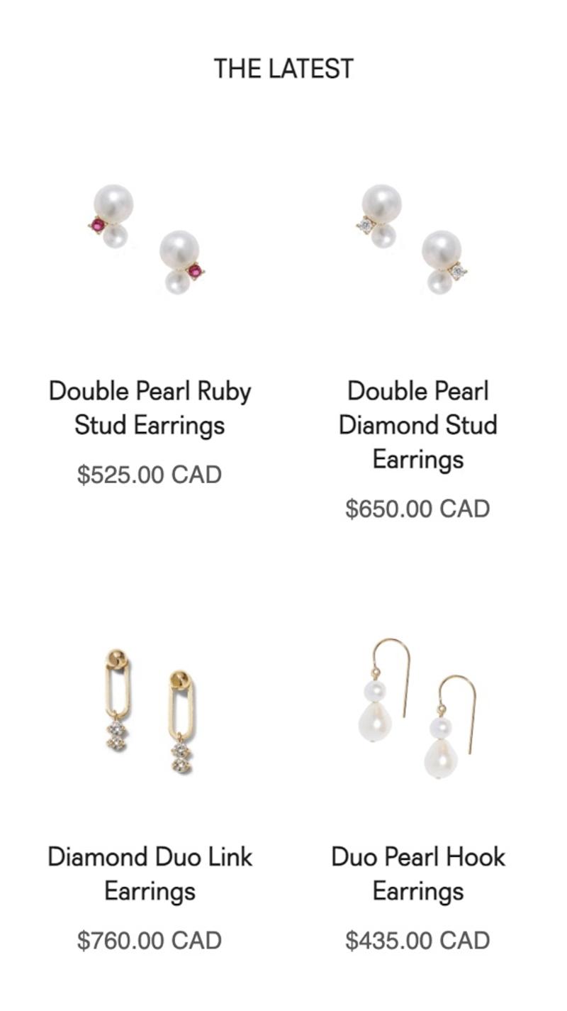
- Poppy Finch: Instead of selected items or popular items, recently added items are chosen here. Especially when a significant portion of the visitors are returning (which I doubt for this webshop), this can be a smart choice. This way, visitors immediately see products that they have almost certainly not purchased before.
Recent publications
Introduction
As mentioned, the homepage of a website fulfills various roles. Recent publications on your own website such as blogs, news articles, videos or white papers can easily be placed on the homepage.
Best practices
Most websites choose to show news articles or blogs on the homepage, and not both. This prevents there being too much content on the homepage and too little other information. Usually it is chosen to show approximately three articles, with the most recent publication shown on the left of the screen. Here too, a horizontal slider can be an option on mobile devices to save vertical space. In terms of design, a display is often chosen similar to how the blog or news overview page also shows these items.
Measuring
Interactions with these components can be measured in web statistics or visitor behavior tools. Again, keep in mind that new items are added at the beginning, so items may change position during the analysis period.
Alternatives
For websites that produce relatively little content, it can be a great idea not to show recent publications on the homepage. If the most recent publication date is months or even years ago, this does not send a good signal to visitors. For parties that post a lot of relevant content, it may be an idea to work with tabs under which you can display blogs, news and videos, for example.
Validating
The chance that direct conversions will result from a click on a publication is small on most websites. Validating changes to these parts will therefore mainly consist of investigating whether there are more or fewer click-throughs to the company's recent publications.
Personalization
For example, you could hide previously read publications, or show publications similar to those that have already been read. However, you should then ensure that publications are not only sorted by publication date, but that other sorting should also be possible.
Examples
- Lundberg: Even though this party posts relatively little new content, they still choose to show the three most recent publications on their homepage. Such old messages can give visitors the idea that this is a company that is not on top of recent developments. If it was chosen to show only one post (for example the most recent blog), this lack of new material was much less visible.
- Mud Jeans: Here we opt for a mix between a blog and a news department. By choosing a slightly longer text, there is a chance that the interest of visitors will be aroused, causing them to click through. However, this long text does take up a relatively large amount of vertical space.
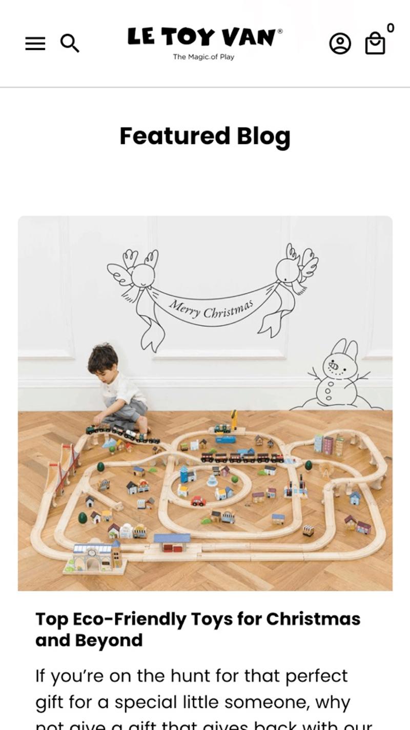
- Le Toy Van: Only one featured blog is shown on this webshop. If there is a reasonably large number of blogs, you can show a relevant article at any time of the year.
- Citrine: Another solution for web shops with a low volume of publications can be to hide the publication date. This way you can show multiple articles on the homepage, without it immediately becoming clear when they were published.
Categories
Introduction
Showing the available categories can be an important signal to visitors that they are in the right place. It can also help to reduce the number of required page views, which can positively contribute to the sustainability of a website.
Best practices
Not all web shops show categories on their homepage. Those that do often show the most popular categories first and do this accompanied by a relevant icon or photo of the product group.
Measuring
Clicks on the category blocks are easy to measure in web statistics or visitor behavior tools. The advantage here is that these blocks usually remain relatively the same over time, so you do not have any challenges interpreting the data.
Alternatives
As mentioned, many online shops choose not to show the categories on the homepage. It is of course also possible not to show all categories, but instead only the most popular categories, for example. In addition, you can vary the display of text, icons, photos or combinations of those options.
Validating
Especially on homepages with relatively high traffic, adding or hiding categories could be validated using an A/B test. However, this does not apply to websites with less traffic. In that case, you could, for example, use web statistics to investigate whether the percentage of visitors who click through to a relevant page from the homepage increases after the categories have been added. This way you can optimize the homepage without requiring many click-throughs.
Personalization
Categories are also ideal for personalization, especially for returning visitors. This way you can display previously visited categories more prominently, or categories in which orders have previously been placed.
Examples
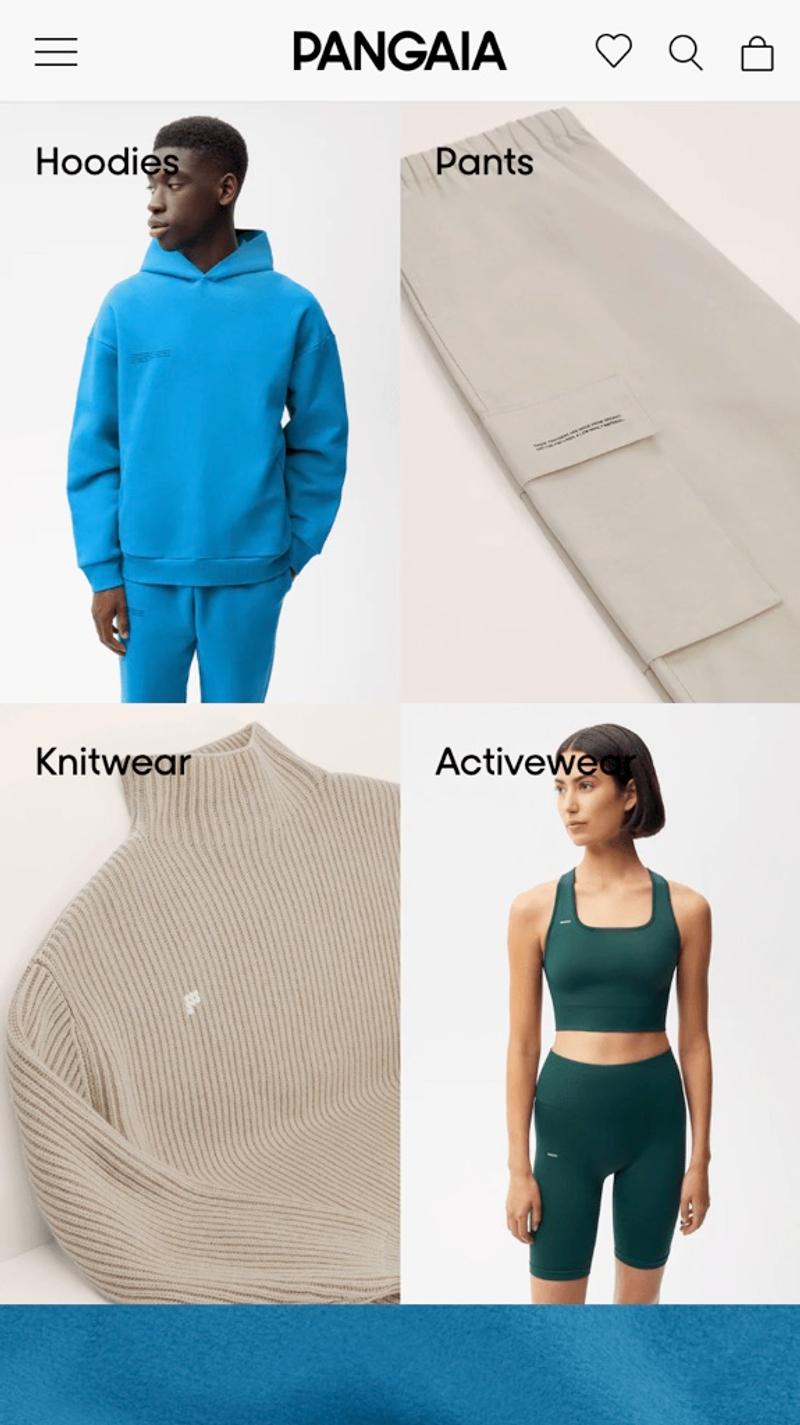
- Pangaia: Static images with text over them is what this party opts for. By working with two items next to each other, a number of categories can be shown simultaneously on the mobile screen.
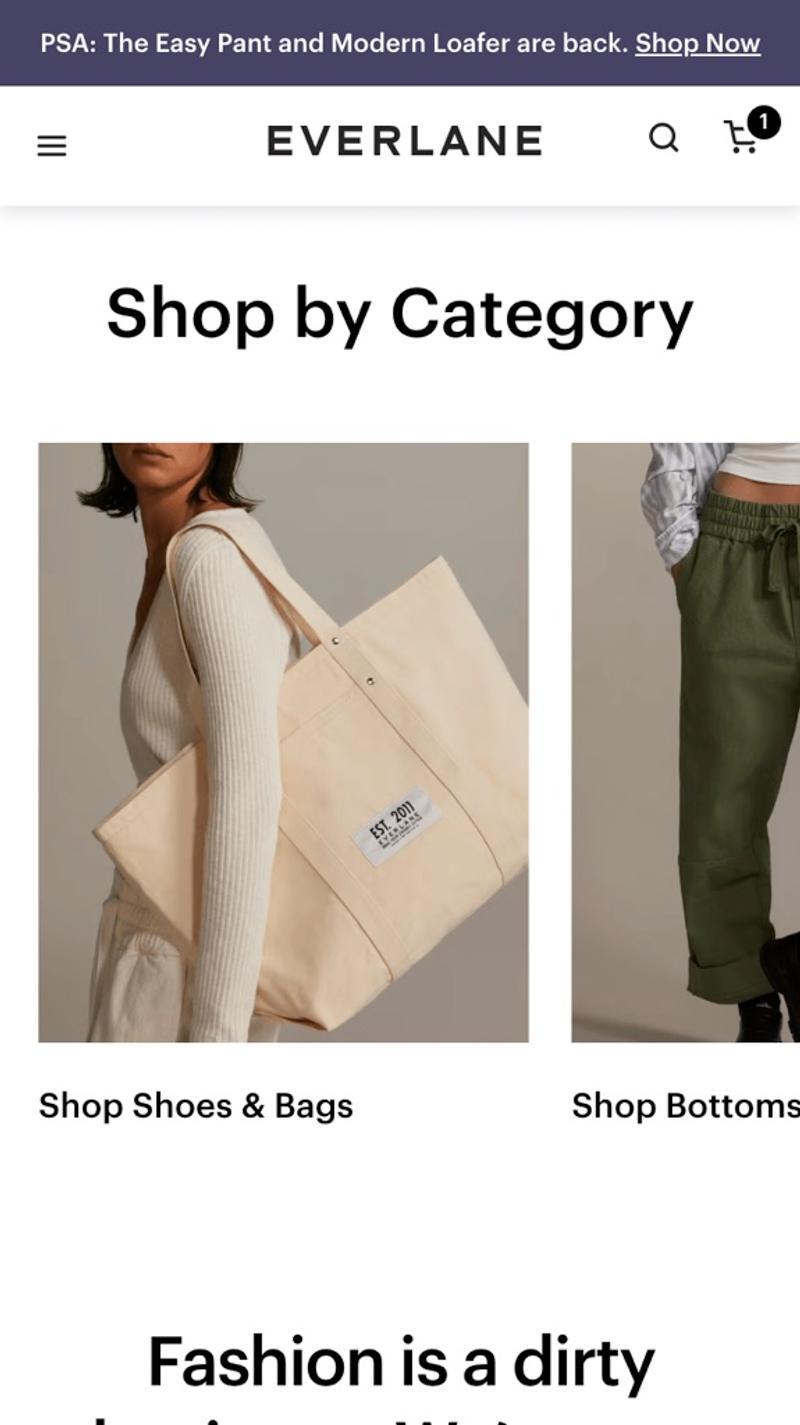
- Everlane: This webshop uses an automatically scrolling slider in which the categories are displayed. Because there is no control whatsoever on the slider, this seems a fairly clumsy choice. In this way you force visitors to wait until their desired category appears.
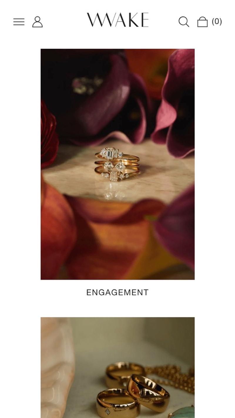
- Wwake: Especially for parties with a limited number of categories, or with categories that account for a large proportion of conversions, a single-column display can be very effective. This way you can show a beautiful image and force visitors to draw their attention to each individual category.
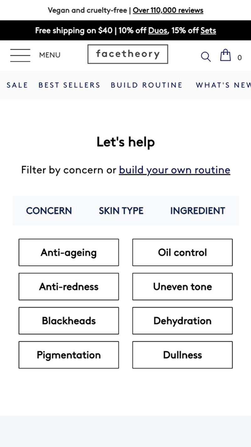
- Facetheory: A more compact representation can be effective, especially for websites with many categories (or segments). This party even opts for a combination of tabs and a compact display of categories to be able to show even more items on a limited area of the screen.
Search bar
Introduction
Some online shops choose to display a striking search bar on the homepage. This way, visitors can search directly for an item, instead of having to use the website navigation to do so. Especially compared to a mobile menu, this can sometimes save a lot of time and effort.
Best practices
The best practice seems to be to only show the search bar in the header of the website. It is therefore important to thoroughly test whether a search bar on the homepage for your webshop is an effective solution. In terms of design, an input field is usually used with a white background, a clear placeholder text, and a striking button behind it.
Measuring
Typically, searches land on a specific search results page. In this sense, the use of the search function on the homepage is easy to measure, especially when the search query is present as a parameter in the URL. However, this becomes more challenging when an option such as autocomplete is also used, which means that 'half' searches will also be included in the URL.
Alternatives
As mentioned, many online shops choose to only show the search bar in the header of the website. On the desktop this is often an immediately visible input field, while on mobile many parties choose to show the icon of a magnifying glass. When clicked, an input field will appear below the header.
Validating
In this case, usability testing could potentially be an interesting method to validate changes. By observing testers being asked to purchase certain products from the homepage, you can see whether they use the search function and what exactly they think about it.
Examples
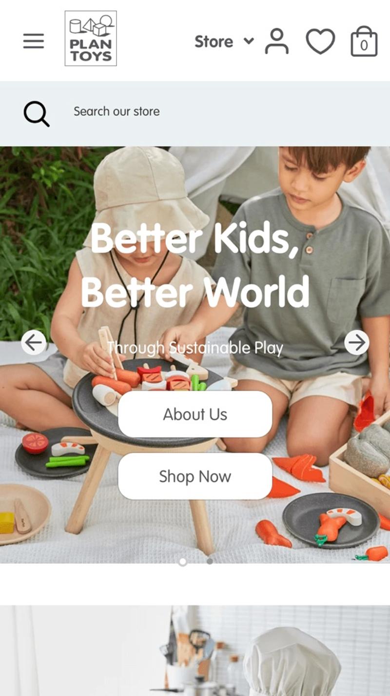
- Plan Toys: Here the search bar is initially opened and shown at the top of the mobile screen. This can be an effective solution, especially for web shops with many products and articles. You then immediately offer visitors the opportunity to search, without having to use the navigation.
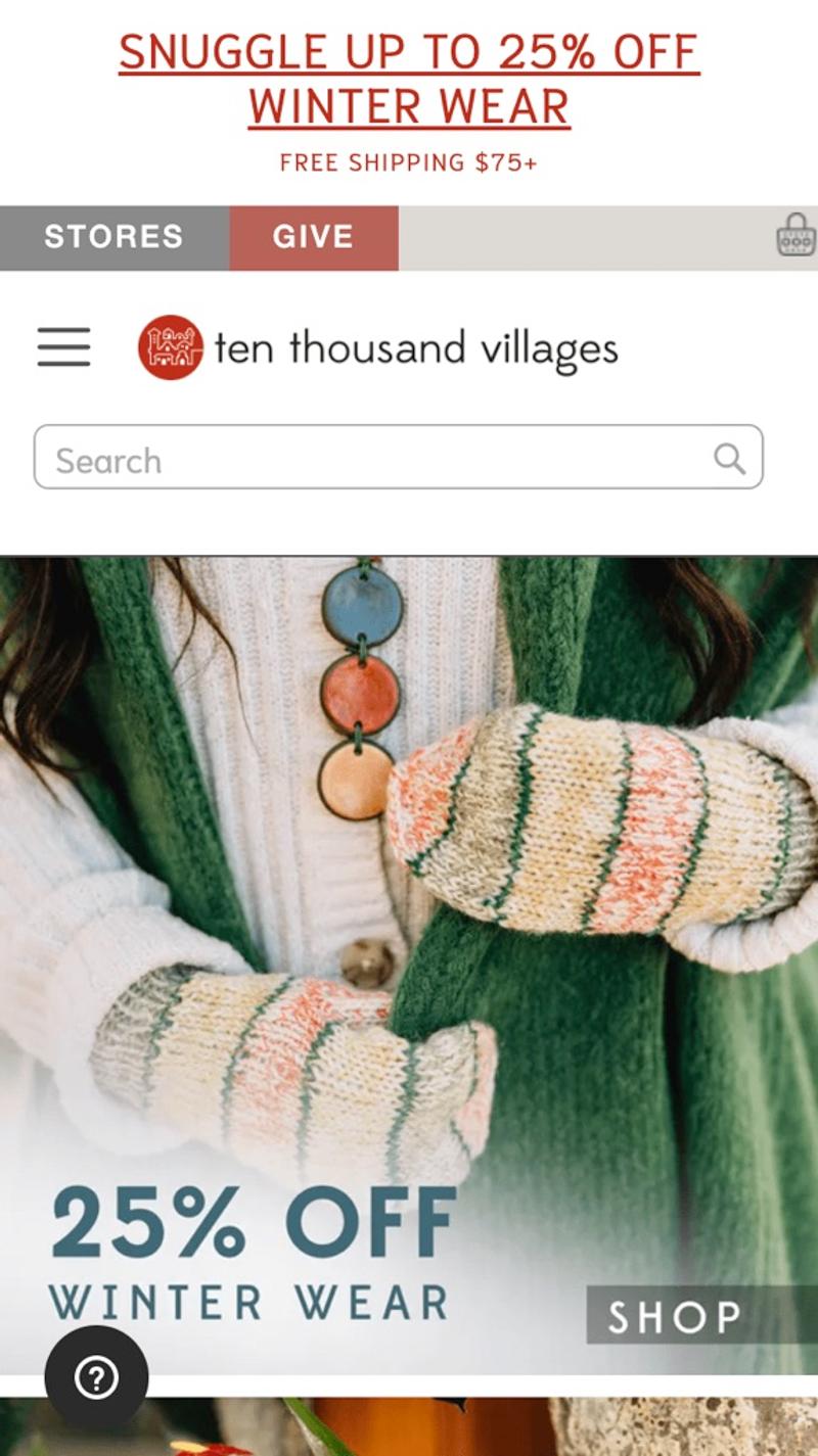
- Ten Thousand Villages: A more traditionally designed search field is shown in this webshop. Even though it is very clear that this is a search field, I personally think the design is a bit substandard. The placeholder 'Search' can also undoubtedly be improved.
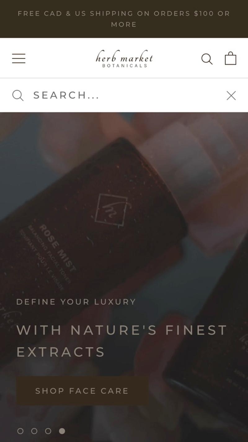
- Herb Market: The screenshots show the search field after clicking the magnifying glass icon. By darkening the background, the search field immediately stands out and will focus the visitor's attention on it.
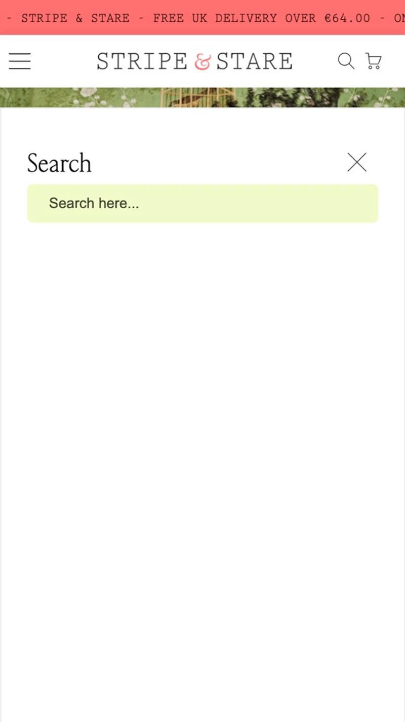
- Stripe & Stare: Here too, the magnifying glass is clicked first. What this party has done is to put a white background behind the search field. In this way, a kind of search results page is immediately simulated where the results can be shown.


