The shopping cart is the last page before checkout. This page type is also called 'shopping cart' or 'shopping basket'. Visitors end up here after they have added one or more products to their shopping cart from a product page. The purpose of these pages is to give visitors an overview of which products have been ordered. This page also often shows items such as shipping costs, VAT, and the option to use a discount coupon.
On average, only about half of cart visitors convert. Only a small increase in this conversion percentage can lead to good growth in turnover. But what changes can you consider for this? What are elements that visitors often use on a shopping cart? What choices do competitors make in this regard?
Products
Introduction
Almost every shopping cart shows a list of the added products. Depending on the industry in which the webshop is active, visitors will usually only have a few products in their checkout or a whole list. In some industries where a shopping cart often contains many products (such as toys, DIY, and personal care), the shopping cart also serves as an overview. Requesters then collect products they are interested in on the product pages and then select in the shopping cart which products they will actually pay for.
Best practices
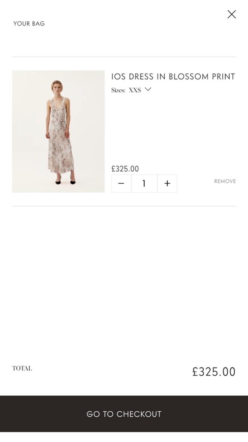
Prevent visitors from doubting exactly which products they have in their shopping cart. Therefore, make sure you have a clear image, for example. Also display the exact name of the item that has been chosen, with associated specifications such as sizes, personalizations, colors, etc. Also display the price per piece, the quantity, and the total price per product. Finally, make it easy to remove items.
Measuring
Because the shopping cart plays such an important role in a webshop optimization process, it is advisable to measure a lot. For example, consider measuring which items (or categories of items) are added to a shopping cart. But also which items are removed from the shopping cart, or whose quantity is adjusted. You can then use all that information to optimize the shopping cart.
Alternatives
There is a lot of leeway in how exactly the shopping cart is displayed on the website. For example, more and more web shops are choosing to work with a kind of 'product overview' that becomes visible as soon as a visitor adds a product to the shopping cart. This overview usually becomes visible on the right side of the desktop screen and covers the entire screen on a mobile phone. From that overview you can then click through to an extensive shopping cart or proceed straight to the checkout.
Validating
Probably the best way to validate changes to the shopping cart will be with visitor behavior analysis tools such as Hotjar or Clarity. With such tools you can see how visitors navigate around the website and also what interactions they have in the shopping cart. Because a relatively large percentage of visitors to the shopping cart also convert, it can be relatively easy to set up A/B tests in which hypotheses about adjustments to the webshop are tested.
Personalization
You may be interested in personalizing the shopping cart to properly set up matters such as shipping and taxes. For example, consider determining whether orders are placed for business or private purposes and, based on this, make smart personalizations with regard to showing or hiding a separate VAT amount. You could also experiment with adding free extras to the shopping cart based on the visitor's order history.
Examples
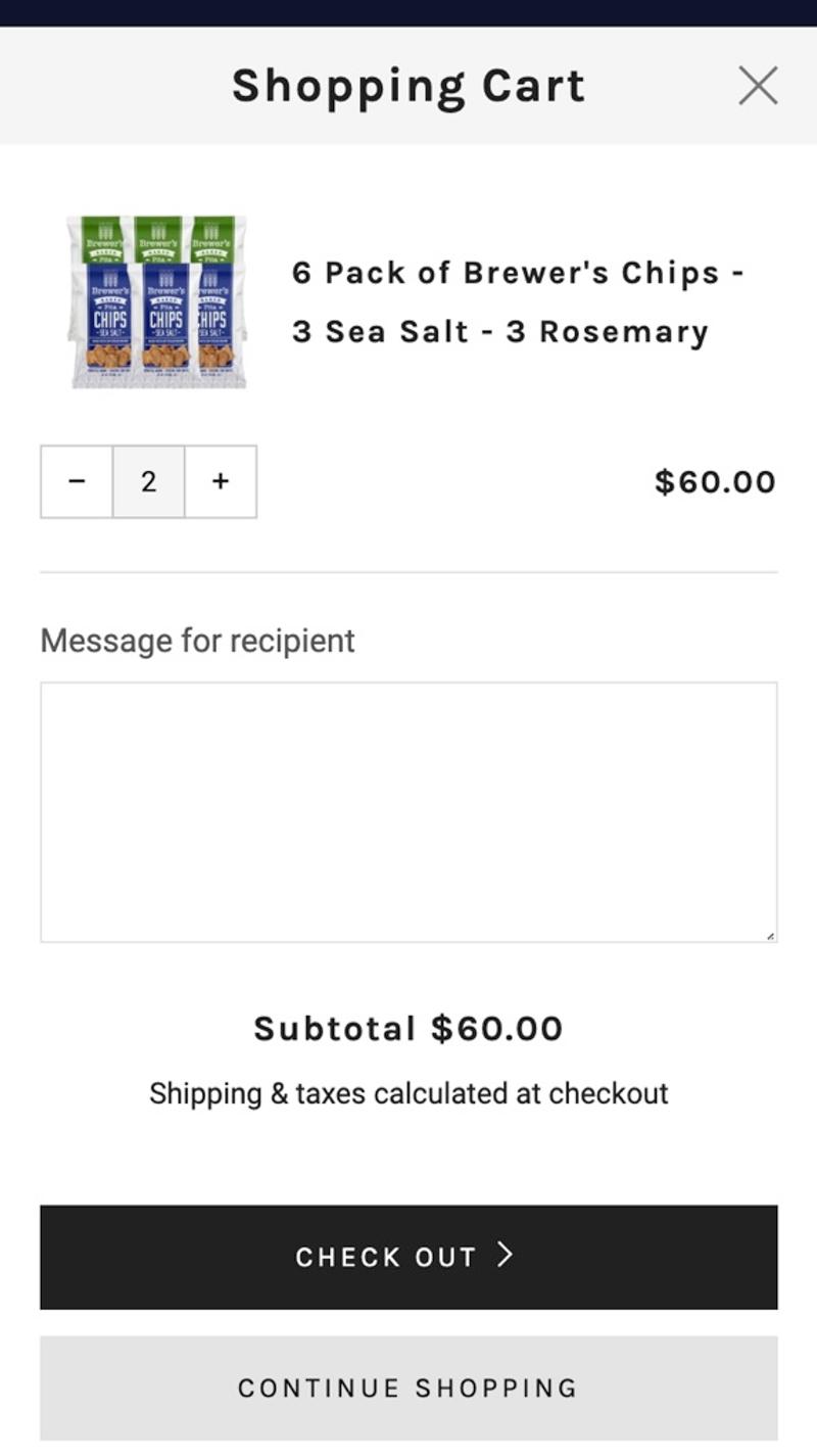
- Brewer's foods: This website opts for a clear and user-friendly display of the products. Details are included in the product name and mobile-friendly elements allow quantities to be adjusted. Due to the chosen display, the price per product is missing.
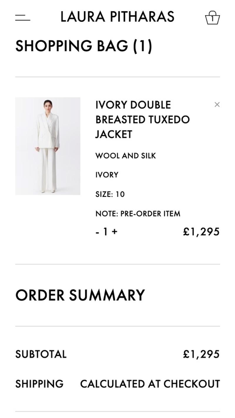
- Laura Pitharas: Here the product properties are displayed separately, which makes it easier to scan the products. Due to the simple design, the element for adjusting the quantities does not immediately look very intuitive. The cross to remove a number is also less noticeable due to the low contrast.
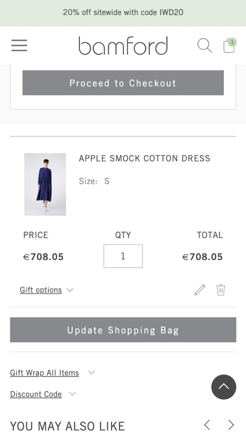
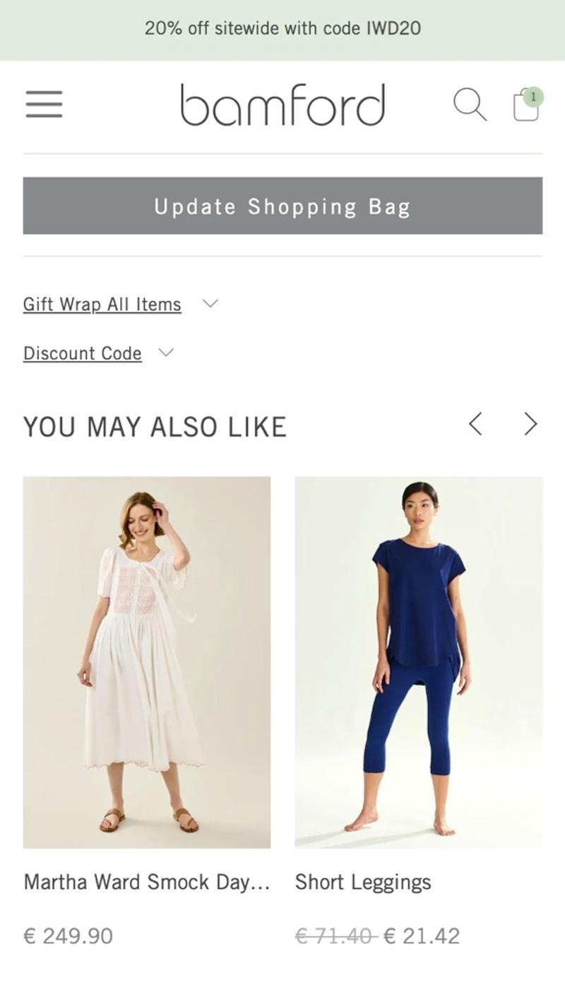
- Bamford: This shopping cart uses an 'Update Shopping Bag' button. Because this (unnecessary) button has been given the same design as the 'Proceed to checkout' button, it attracts a lot of attention.
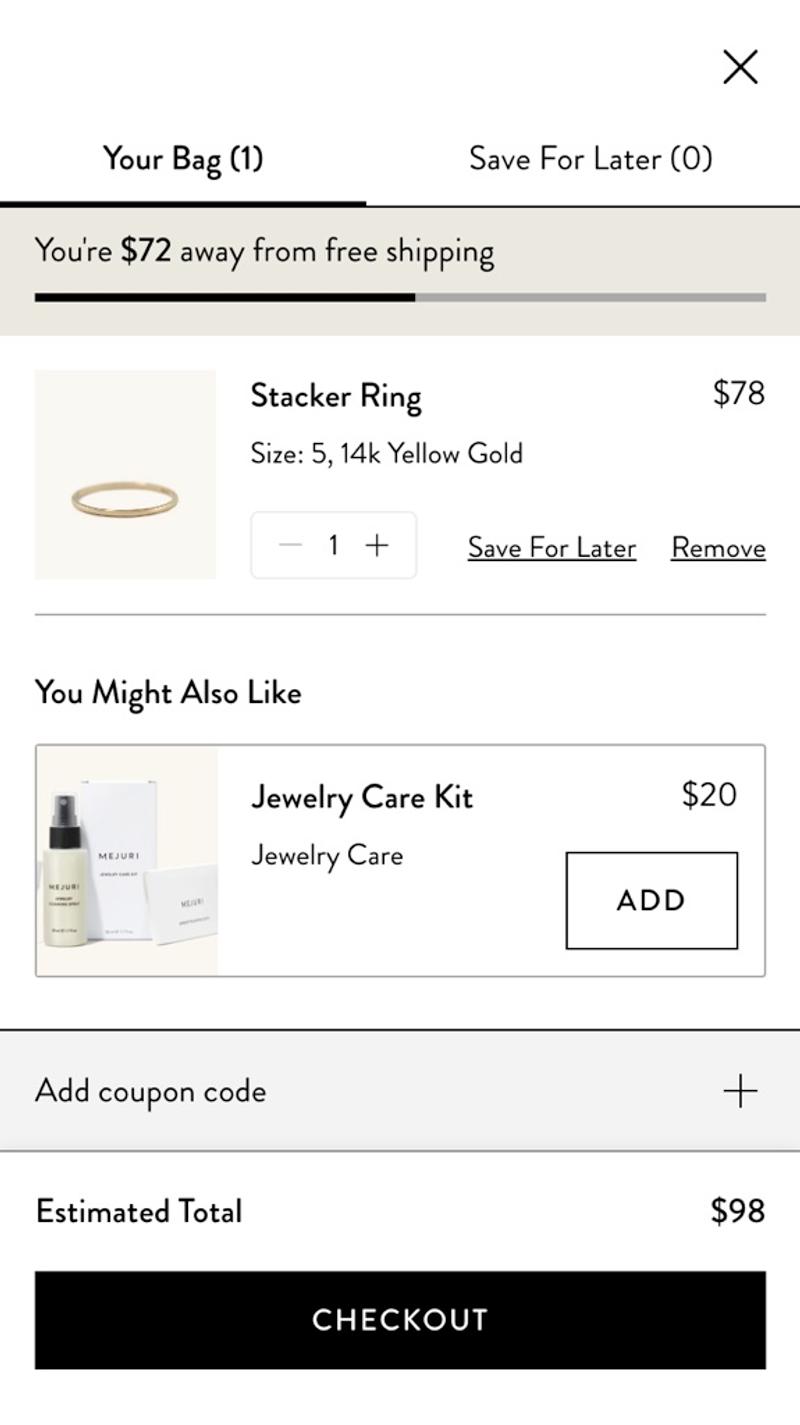
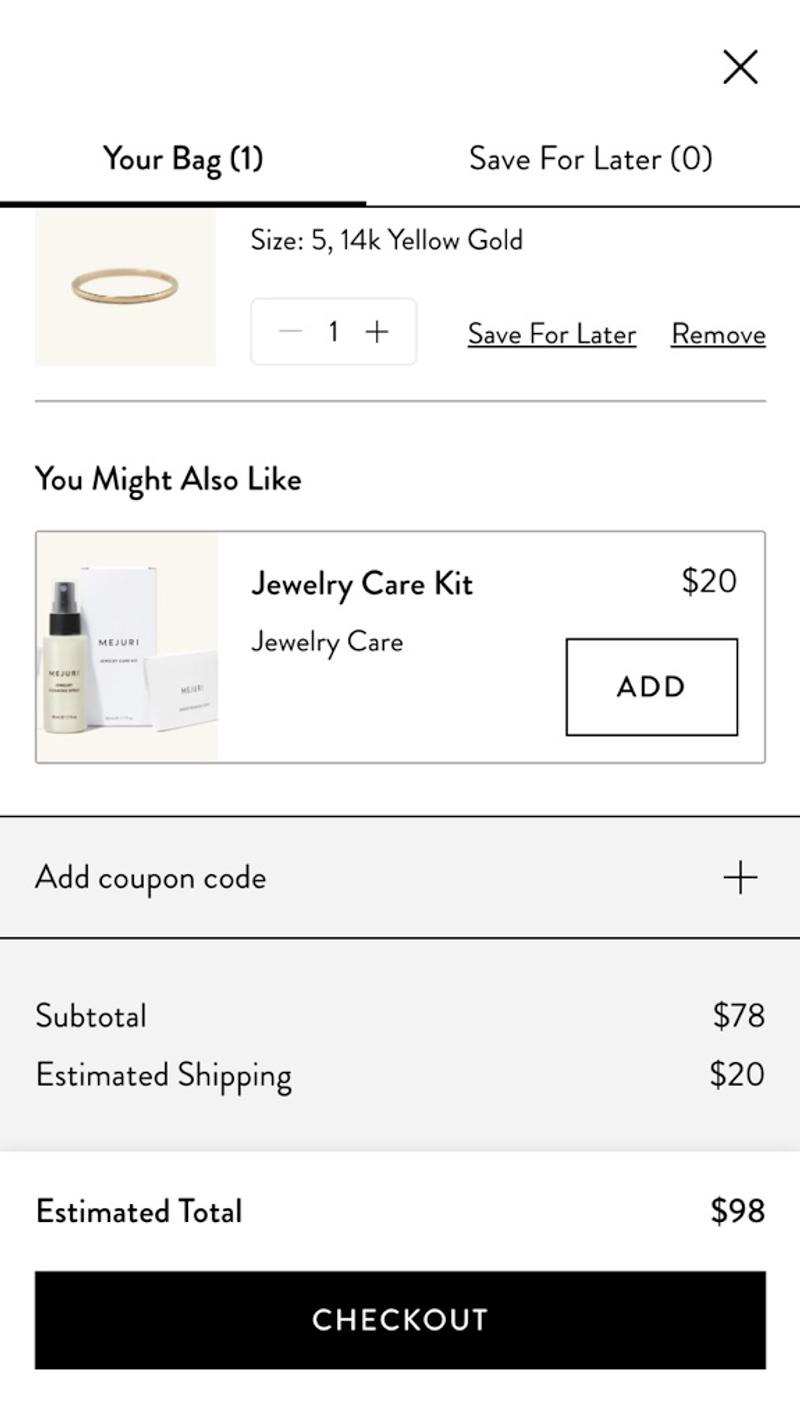
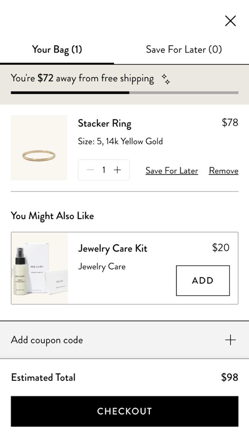
- Mejuri: This webshop chooses to add a 'Save for later' link to an item. The reason for this is probably that many visitors to this webshop have a relatively longer customer journey and will not immediately convert.
Free and non-binding 1 hour session?
Gain insight into your challenges surrounding CRO
Shipping
Introduction
Matters surrounding shipping and returns are different for every webshop. It is therefore very important to be extra clear about this to visitors. Unexpected delivery costs later in the checkout funnel are cited by Shopify as an important reason for abandoned shopping carts.
Best practices
For a national webshop, immediate display of the (estimated) shipping costs is recommended. For international web shops, it is advisable to make it clear in the shopping cart how the shipping costs can be determined. This could be, for example, with a tool that determines the shipping costs based on the address or with a message that the shipping costs become clear later in the checkout. More and more web shops are also making it clear in a graphic way how far the visitor is from the border for free shipping. This can motivate visitors to add more products to their cart or choose more expensive alternative products.
Measuring
Measuring interactions around shipping costs is actually only possible if a tool is used for this purpose. You can then investigate how often visitors use the cost estimation tool and also what shipping costs emerge from this, for example.
Alternatives
The main options you have regarding shipping costs are to show this in the shopping cart or wait until the checkout. If you choose to only show the shipping costs at the checkout, it is advisable to mention this in the shopping cart.
Validating
Shipping costs can be a tricky part to get a handle on. One approach to consider is to use surveys to ask existing customers or prospects what they think about shipping policies. Remember not only to ask for shipping costs, but also to think about returns, shipping methods, sustainability, delivery times, etc.
Personalization
Shipping methods can be personalized based on previous orders when that information is available. For example, a guess can be made based on the IP address about the country to which the products should probably be sent.
Examples
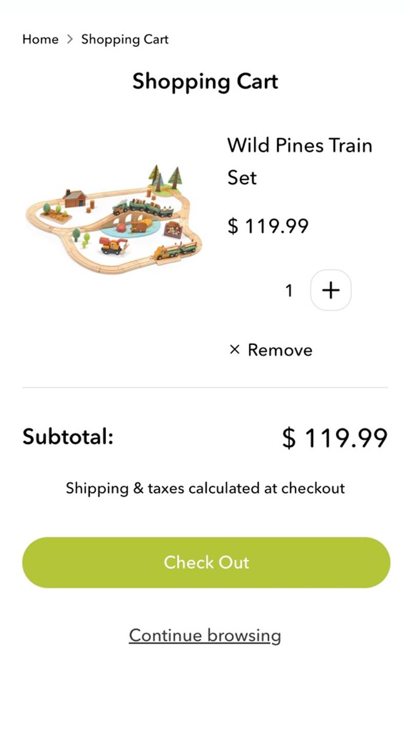
- Tender leaf toys: Here the message 'Shipping & Taxes calculated at checkout' is shown in the shopping cart. This makes it clear to the visitor when they can expect clarity about these additional costs.
- Mejuri: In this webshop, an estimate of the shipping costs is shown directly in the shopping bag. This way, the visitor immediately knows what the approximate amount will be charged.
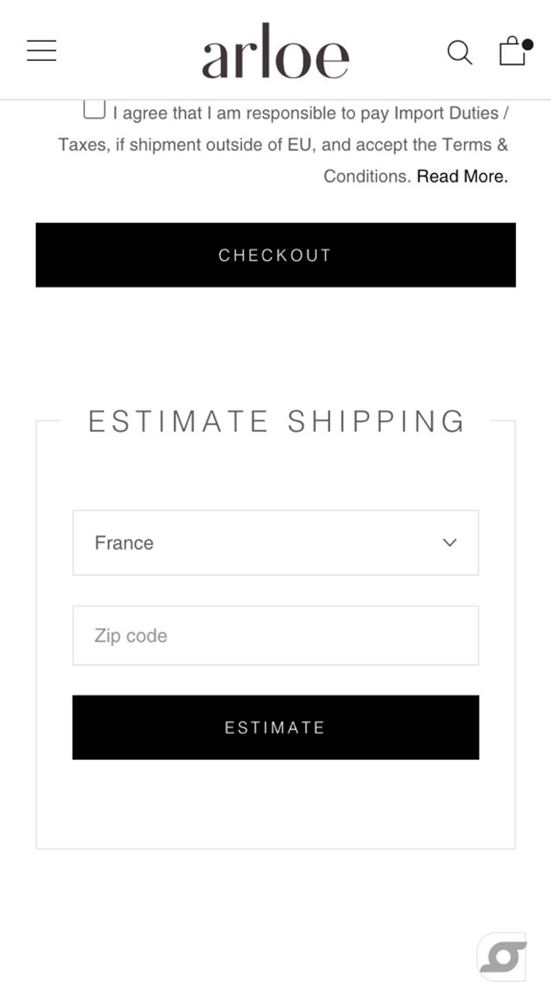
- Arloe: This international webshop uses an 'Estimate shipping' tool. This allows visitors to get an estimate of the shipping costs they will have to pay based on their country.
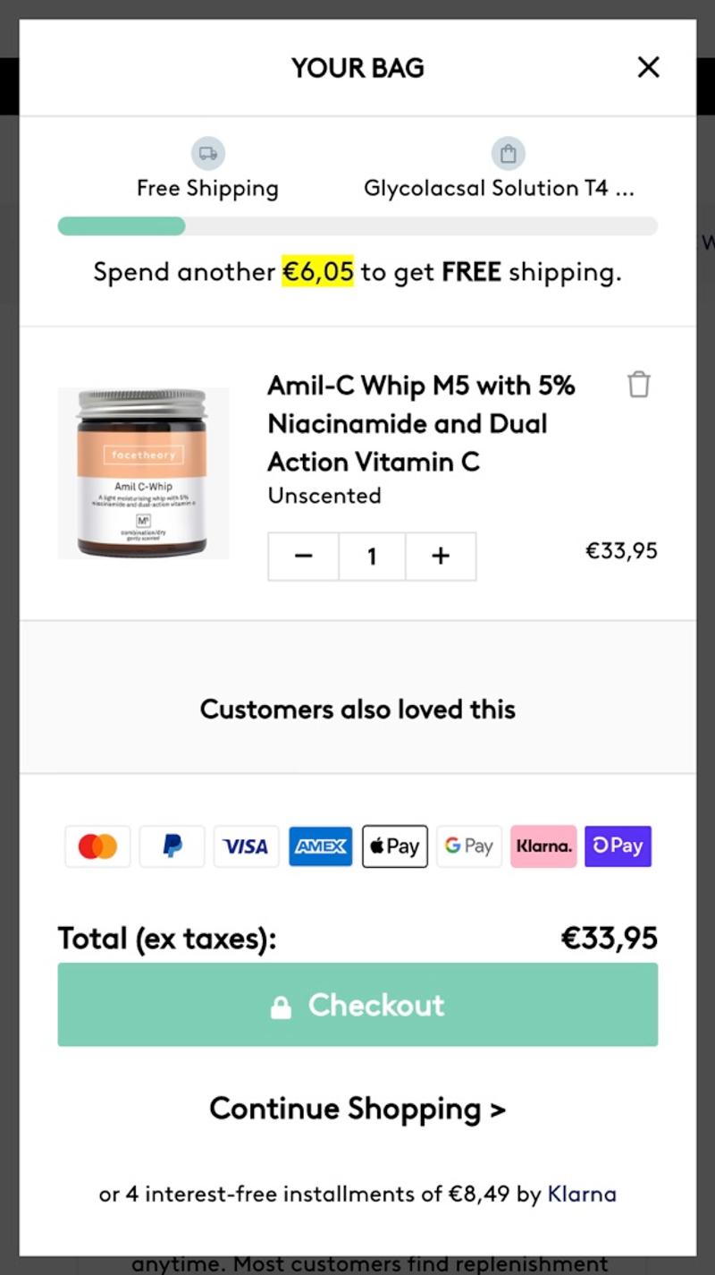
- Facetheory: A bar will appear at the top of this shopping cart. There, visitors can see how much they still need to add to their shopping cart to qualify for free shipping.
Buttons
Introduction
Buttons in the shopping cart can serve various purposes. For example, there are the obvious 'Proceed to checkout' and 'Continue shopping', but also 'Update shopping cart' and various express checkout buttons are regularly present.
Best practices
Many of the web shops examined show a striking number of buttons in the shopping cart. Which buttons should and should not be shown and how prominently they should be displayed will differ per webshop. For example, for a webshop where most people only buy one product, a 'Continue shopping' button is much less interesting. It is therefore important to properly identify the needs of visitors in order to figure out the best solution.
Measuring
Because this mainly concerns buttons, measuring is easy. For example, save which 'Express checkout' options are used most often (and then put them at the top). Also see to what extent visitors (on various devices) use a 'Continue shopping' button and whether they use the 'Proceed to checkout' button at the top or bottom of the shopping cart.
Alternatives
Some buttons are less important than others. As mentioned, however, this varies considerably per webshop. In addition to whether or not certain buttons are shown, there are also many options regarding design and positioning. Think of sticky buttons, text on the button, buttons in the form of links, and striking colors.
Validating
The shopping cart can be seen as the start of the checkout funnel. There is therefore a considerable chance that a visitor who is in the shopping cart will convert. AB testing is therefore the best form of validation.
Personalization
Buttons in the shopping cart are relatively difficult to personalize. For example, visitors will not always choose the same payment method and they will sometimes want to continue shopping and sometimes not.
Examples
- Ninety percent: Here a product overview is chosen instead of a complete shopping cart. For that reason there is only one button, namely 'Go to checkout'.
- Tender leaf toys: This webshop has opted for a slightly more extensive design. In addition to the standard forward button, there is a secondary button (in the form of a link) with the text 'Continue browsing'.
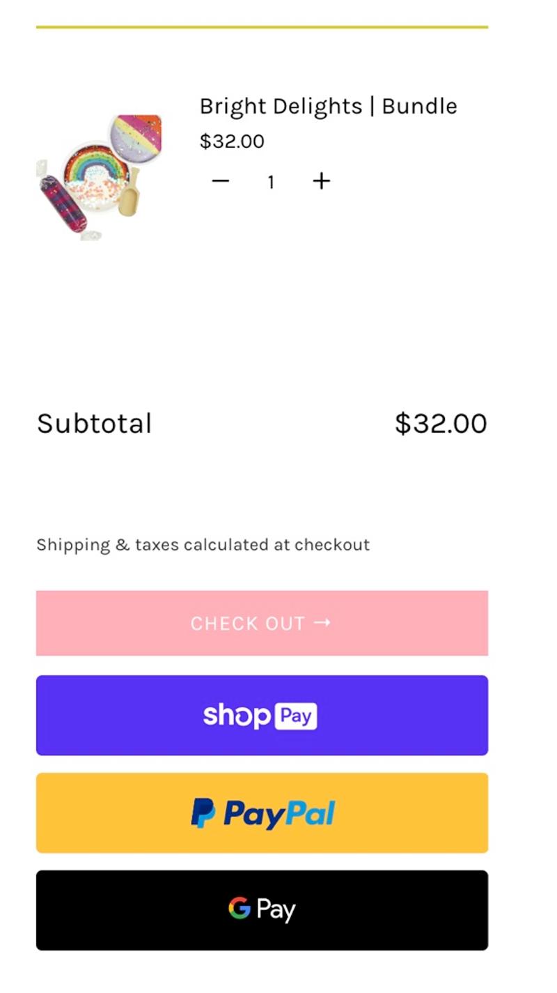
- Land of dough: In this case there are a large number of buttons that are all displayed close to each other. Although the logos are of course very recognizable, this does give a messy impression.
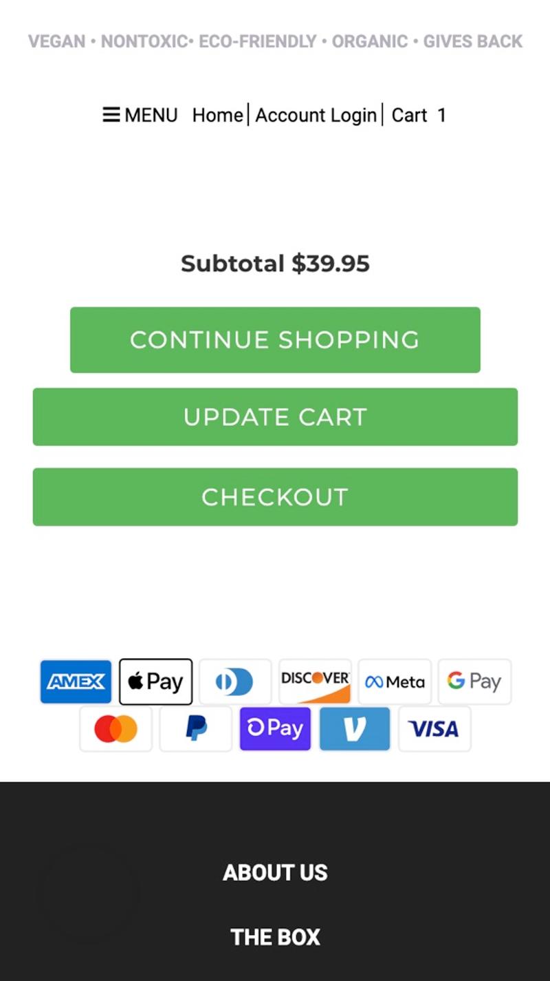
- Love goodly: Exactly three buttons with an identical design and completely different function are shown here. This is probably very confusing for visitors. They will really have to think about which button to click.
Cross-sells
Introduction
Cross-sells can be beneficial for both visitors and webshop owners. This way, a visitor can easily add an extra product and the webshop increases its average order value and turnover. It is very important that the cross-sells shown are relevant.
Best practices
Make sure it remains clear which product has already been chosen and which can still be added. Try to display items that are as relevant as possible and make it easy to add a cross-sell. By providing enough information (but not too much) about a cross-sell in the shopping cart, it should optimally be possible to add a cross-sell with just one click, without leaving the shopping cart.
Measuring
Both the way cross-sells are displayed and the actual products shown offer opportunities for optimization. Therefore, try to find ways to store this data in a reliable and valid way. Also take into account which items (or types of items) are in the shopping cart and what else is known about this visitor on the website.
Alternatives
Instead of cross-sells, you could also choose to focus on up-sells. You then try to sell 'more' of existing products (such as larger packaging or larger quantities) instead of promoting other products. Of course, it is also possible to try out what happens when no cross-sells are offered in the shopping cart.
Validating
Cross-sells offer a good opportunity for A/B testing. After all, they can have a significant effect on whether or not a visitor starts or completes the checkout. The average order value can also be significantly affected. In addition to A/B testing, web analysis also offers an interesting option for validation because a lot of data can be stored.
Personalization
This part offers excellent possibilities for personalization. For example, consider increasing the relevance by including order history, viewed products, or the products in the shopping cart.
Examples
- Bamford: Here there seem to be fairly random products displayed at the bottom of the shopping cart. Because this is done in the form of a carousel, it is also difficult to get an idea of which products exactly they are.
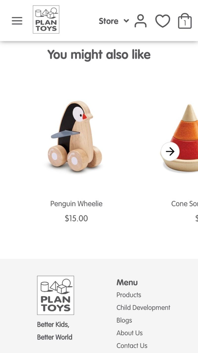
- Plan toys: In this webshop, a number of products are shown at the bottom of the shopping cart. In terms of age, these products match the products already in the shopping cart and are therefore extra relevant. However, it is not possible to add these products to the order without leaving the shopping cart.
- Mejuri: In this shopping cart you can directly add a relevant item to your order with one click. Because this option is still visible above the CTA button, there is a greater chance that visitors will use it.
- Facetheory: Instead of showing only one cross-sell in the product block, this party opts for a carousel. This way, as a visitor you can browse through some products and easily add them. Using the carousel (compared to just one cross-sell) makes it less easy to click on an additional product.


