Almost every webshop has various category pages. This page type is also called 'category page', 'product overview', 'product listing page', or abbreviated 'PLP'. The primary purpose of this page is to provide visitors with an overview of which products are offered in a particular category. Visitors often have the option to sort and filter products.
Category pages are regularly used as a landing page from advertisements, but sometimes visitors also arrive there after they have clicked through from the homepage. To optimize a category page you need to have an idea of the possibilities. What parts are usually included on a category page? To what extent do they comply with best practices? And what are alternatives that can be considered for optimizations? In this article, various common components on a category page of an online store will be discussed.
Filters
Introduction
The vast majority of online stores use filters on the category pages. These filters allow visitors to hide products that are not relevant to them at the moment. This in turn increases the chance that visitors will click through to a suitable product page and make a purchase. Offering good filters is therefore an effective form of online store optimization.
Best practices
On desktop devices, filters are usually displayed one below the other in a column on the left side of the screen. An alternative to this is to display horizontally above the products. On mobile phones, filters are usually initially hidden and only visible when a specific button is clicked.
Measuring
There is a lot to measure about filters. For example, you can use data analysis or visitor behavior analysis to investigate which filters are used most often. You can also investigate which values are selected by visitors for the various filters. You could even save the use of certain filters as a micro conversion or use them as a secondary AB testing goal for certain tests.
Alternatives
Filters are difficult to replace as functionality. After all, you want visitors to be able to find products that are relevant to their search as easily and quickly as possible. What you do have a lot of leeway in is how you design the filters. For some filters you can choose between different form fields such as ranges, input fields, or checkboxes. There is also a lot of variation in how web shops handle the 'Show more' option per filter.
Validating
AB testing can also be used to investigate, for example, whether horizontal filters lead to a better conversion rate.
Personalization
You could show filters that are often used by certain visitors higher in the column. You can also offer the option to save certain sets of filter values. An example of this is the 'Saved search' that you can save on the housing site Funda.
Examples
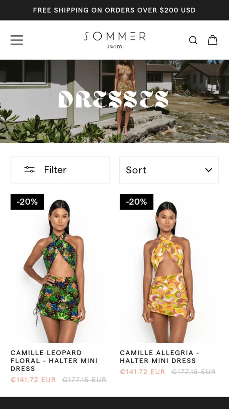
- Sommer: A common setup is used here. Two buttons are shown next to each other above the products, one for filtering and the other for sorting. After tapping 'Filter', the filters are shown in a layer over the current content. An idea for potential improvement would be to give the buttons a background color to make them stand out more.
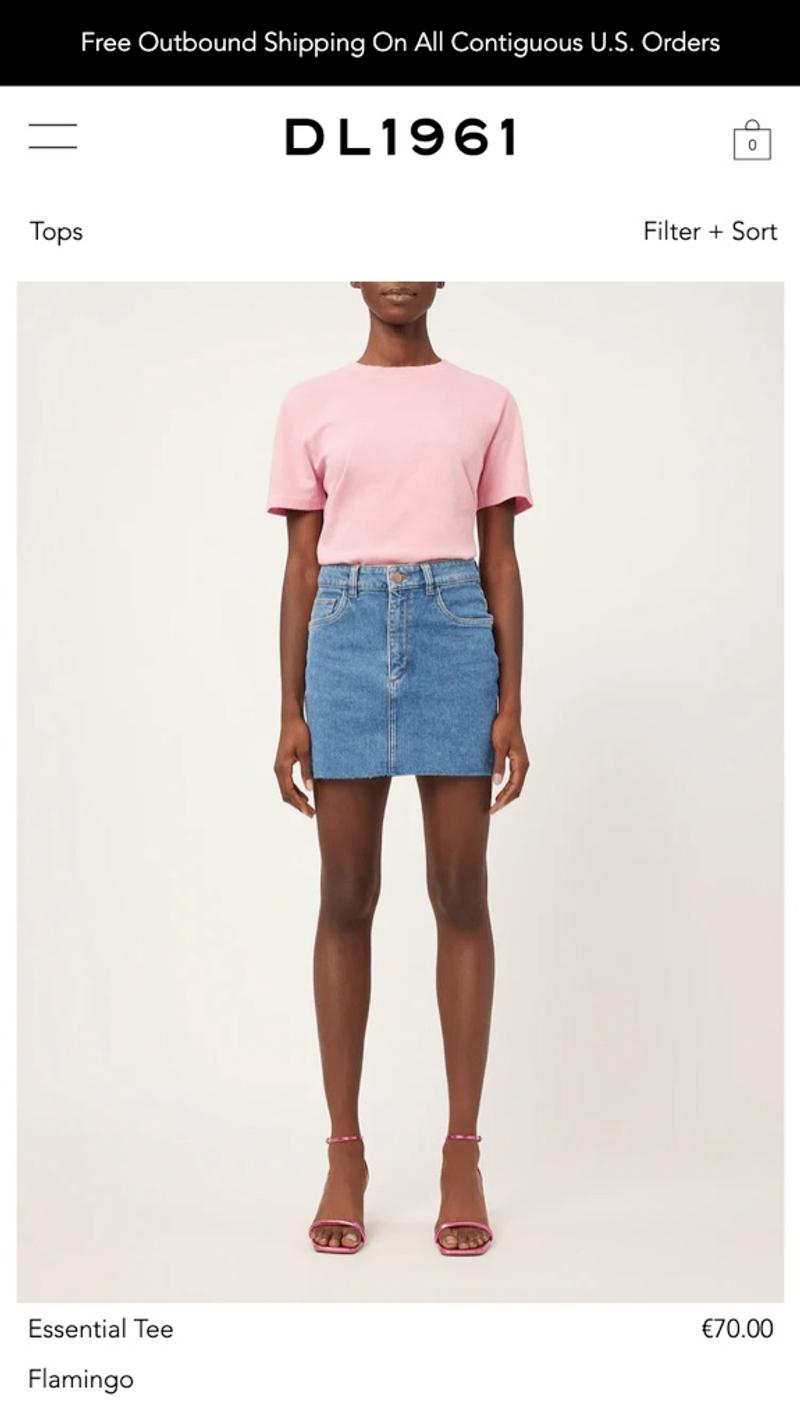
- DL1961: On the right side of the screen the text 'Filter + Sort' is shown in a small font. Because almost the same font is used for this as for other text on the page, I suspect that many visitors will overlook this. A possible improvement could be to put a line around the text to make it clearer that this is a button.
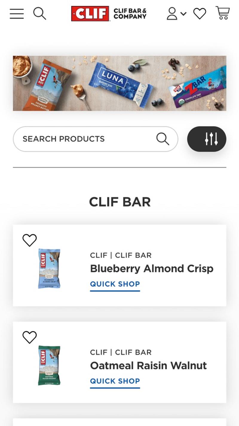
- Clif: On this product listing page, a combination of a search field and a filter button is chosen. Because the search field is initially visible, visitors can immediately start typing. It was decided to put an icon on the button. User research such as a five second test could help to determine whether visitors understand what this icon stands for.
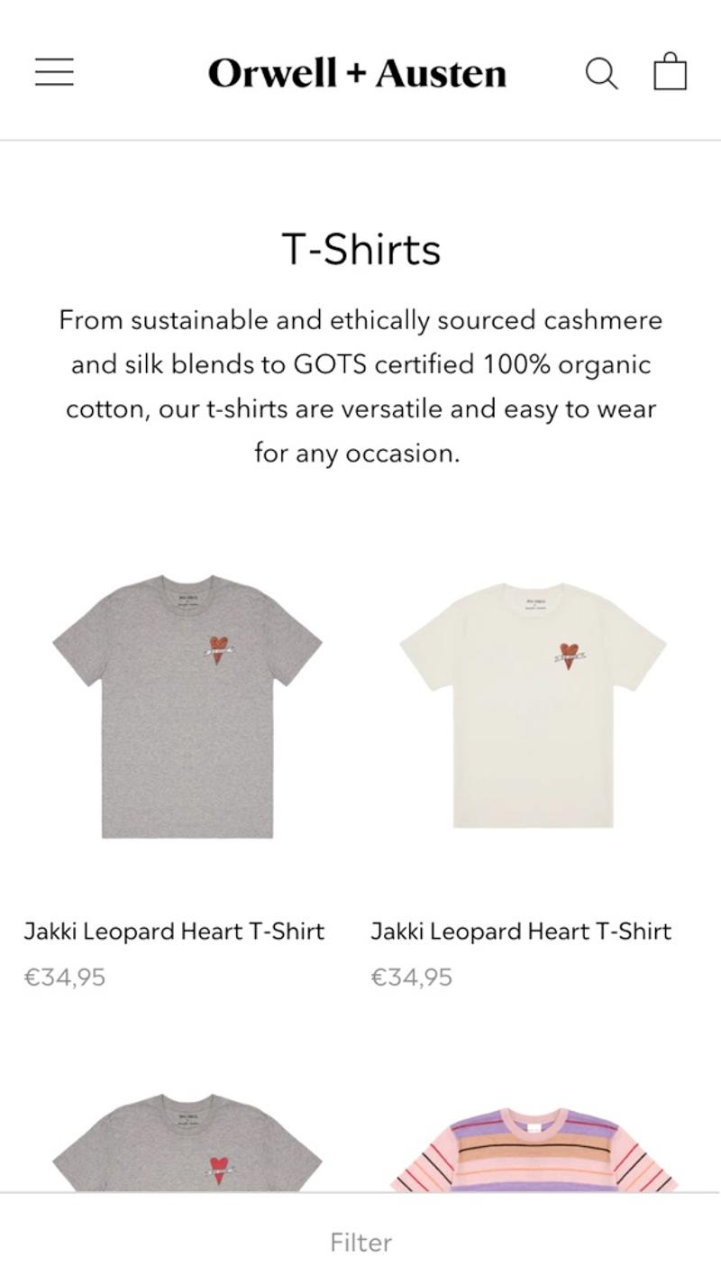
- Orwell & Austen: This webshop uses an alternative solution. The filter button is displayed sticky at the bottom of the screen. If this webshop wants to improve its category page, I would again recommend testing whether a colored button leads to better results, because the button is now hardly noticeable.
Free and non-binding 1 hour session?
Gain insight into your challenges surrounding CRO
Sorting
Introduction
With this element the order of the products can be adjusted. Especially on mobile devices, these options can be very important because visitors can only view a few items on their screen at a time.
Best practices
Most web shops choose to initially display this element in the form of a button. When this is clicked, it appears that behind the scenes a so-called select element is often used to let the user make a choice. Please note that each device can display such an element in a slightly different way, which can sometimes make text difficult to read. Commonly used options include options to sort by price, date, relevance, featured, and product name.
Measuring
Do visitors convert better after they have actively selected a different sort? Are there certain sorting options that are rarely or never selected? Are different sorting options selected on certain categories than on the rest of the pages? Answers to these types of questions can mainly be found based on data from web analysis packages.
Alternatives
As a webshop, you could choose to work with a different sorting as standard. My experience shows that a large proportion of visitors do not use the sorting element, which makes the standard order very important. Adding or removing certain sortings can of course also be investigated.
Validating
As part of a webshop analysis, you can, for example, get started with user research. Both an analysis of visitor behavior and a user test can provide insight into the extent to which this element is helpful to visitors. However, due to the low degree of interaction that this element often has, it can be challenging to collect sufficient measurements to make well-founded statements about effectiveness.
Personalization
Some personalization could help make a product listing page significantly more effective. For example, if it turns out that a visitor chooses a certain sorting several times, you could initially offer it to that visitor in the future. You can also learn more from the chosen values. A visitor who sorts by 'Price low-high' will probably be more open to a promotion where a discount is given than a promotion where the latest expensive model is presented.
Examples
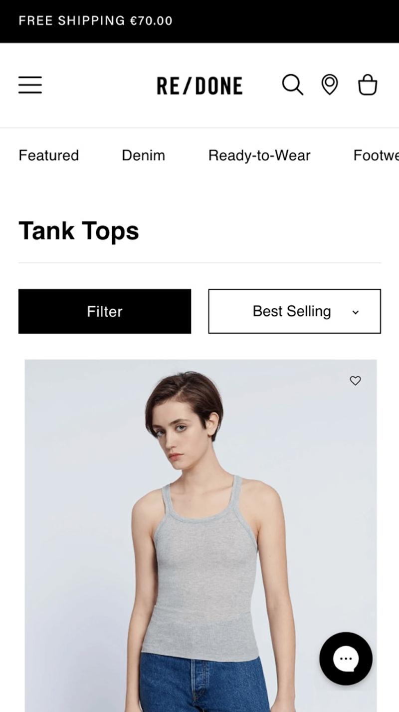
- Re/done: This is approximately what the sorting element looks like on most web shops. However, what they have done here is to show the current sorting method. This is the usual method on desktop, but may be a bit confusing on mobile. A possible idea for optimization is to add 'order' icon to the button. This may make it clearer what you as a user can do with this element, even if 'Sort' is not explicitly stated next to it.
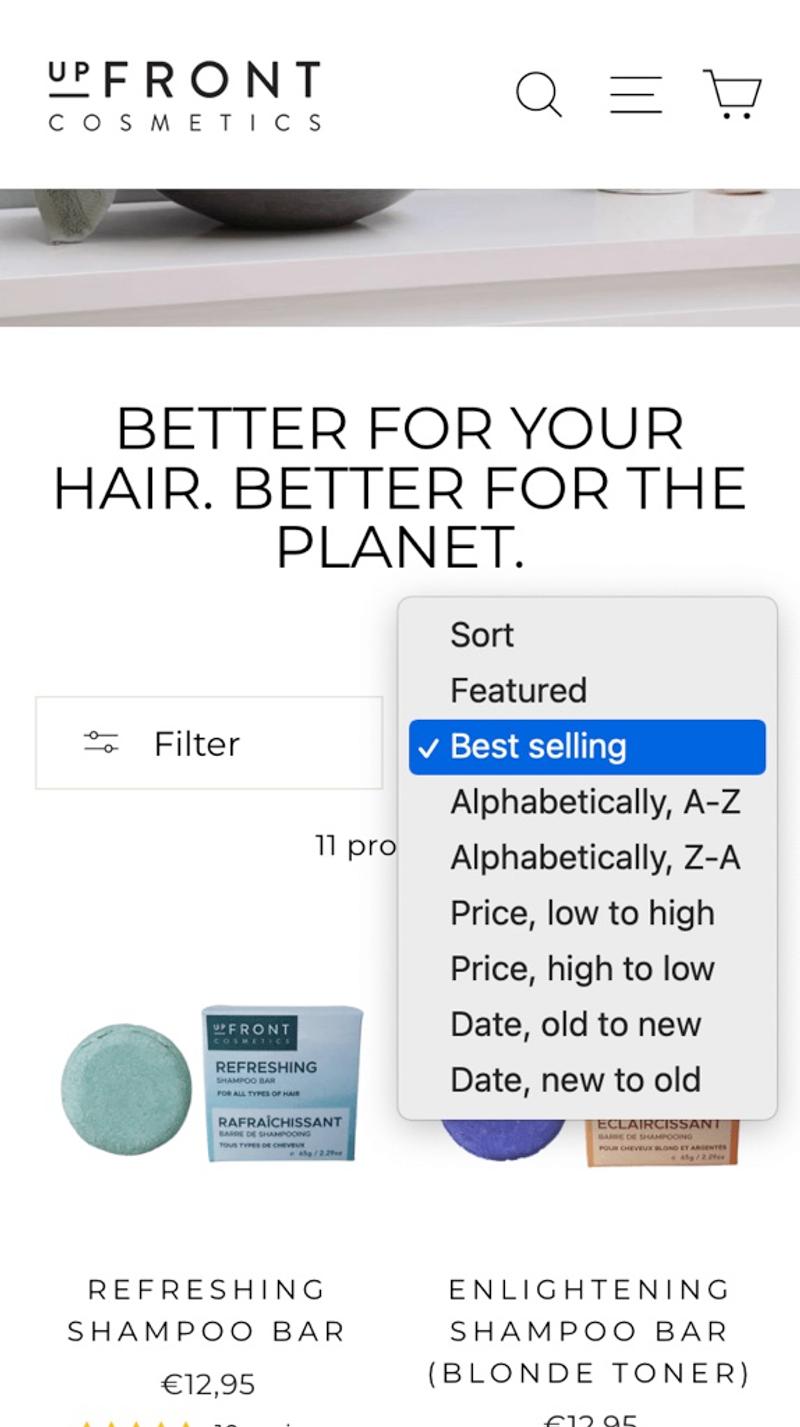
- Upfront: This is the appearance of a select element on an iPhone after the button has been clicked. Visitors can now easily select the desired sorting, after which the 'popup' closes again and the button becomes visible again. It is recommended to show the chosen sorting in the button after selection to confirm the user's choice.
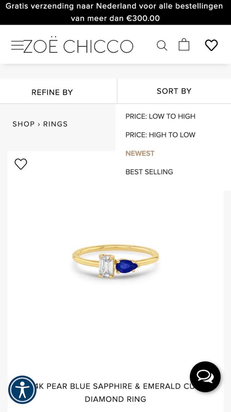
- Zoë Chicco: Instead of a native select element, a custom layout is chosen here. What immediately becomes visible is that the options are not very noticeable. Because a white background was chosen for the options, they blend in a bit with the design of the rest of the website.
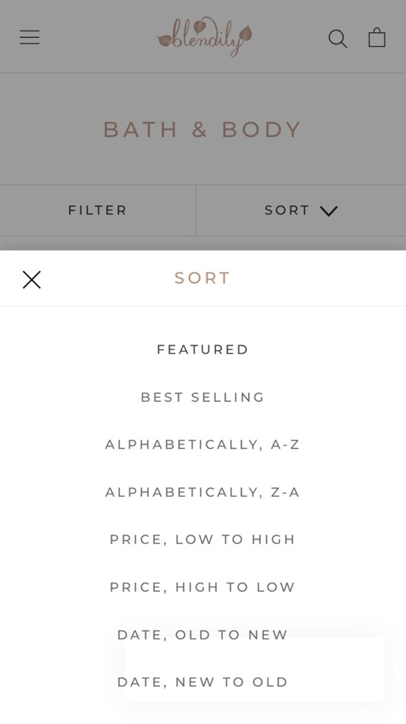
- Blendily: Here a so-called overlay is chosen. Such overlays are popular on mobile devices because there is little available screen space. However, they are usually used for zooming in on images to display the mobile menu. However, as you can see, it also works great for the sorting options. A good alternative to test I would say.
Products
Introduction
Ultimately, everything on a category page is about showing products. As a webshop, you should then consider what information about a product you already show directly on the product page (name, images, price, reviews, discount, labels, etc.) and how you then display that data in the 'product cards'. You should also consider how many products you show next to each other.
Best practices
Most web shops choose to show an alternative image on the desktop when hovering over the product. With a hover, something is often done with the design (for example a shadow or an edge around the card) to focus on that product. Because the price is such a crucial feature of a product, almost all web shops choose to show it on the product listing page (PLP). Beyond those two choices, it becomes difficult to indicate best practices. This element is therefore an important part in many AB tests on the category page.
Measuring
Because the products are the most important part of a category page, a large proportion of visitors interact with them. It is therefore relatively easy to gain more insight into visitor behavior with this component using various CRO tools. For example, you can use scroll maps to investigate how many products an average visitor actually sees. With session replays you can see how visitors interact with the product blocks and using data analysis you can investigate which parts of a card are regularly used.
Alternatives
A category page without products adds little to an online store. Of course you can still think of a design with category pages and sub-category pages. In addition, only blocks are shown on the category pages that redirect you to the deeper pages where products are actually shown.
Validating
You can improve the usability of the blocks by doing good user research. You can then investigate the resulting hypotheses using A/B tests. Make sure that you do not investigate too many aspects of the card at the same time in one variant. To avoid these types of mistakes, you can have someone else check your A/B tests.
Personalization
You could think about showing different labels for certain segments. The number of products shown next to each other can also be personalized in theory. The main challenge you will have here is identifying which group a visitor best fits into.
Examples
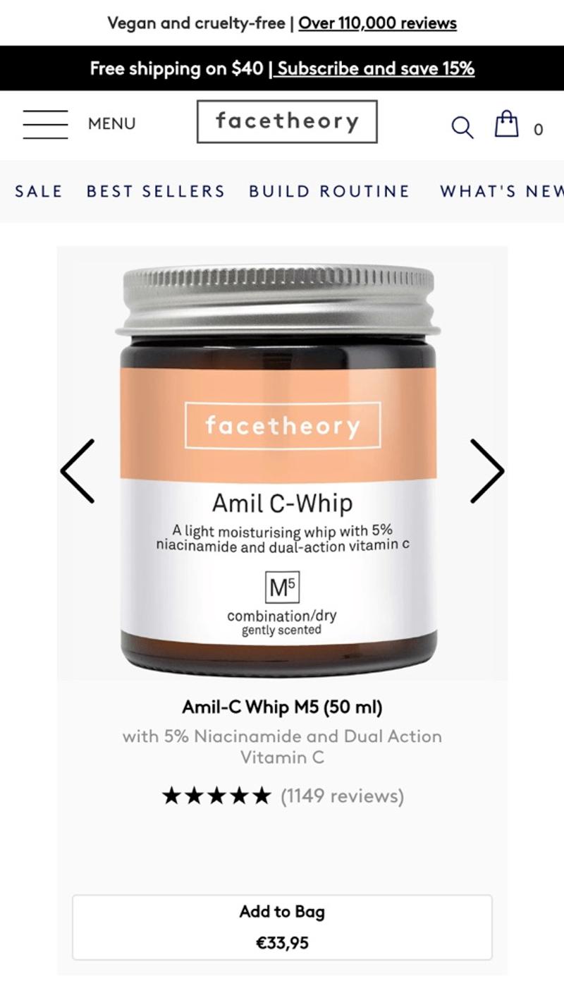
- Facetheory: On this website, one product is shown at a time in width. This has advantages and disadvantages. The main advantage is that the focus is not divided between multiple products. However, this has the disadvantage that you have to scroll a relatively long time to compare multiple products.
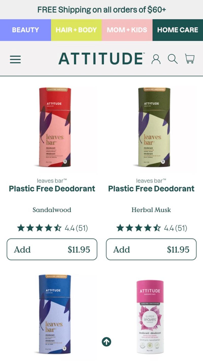
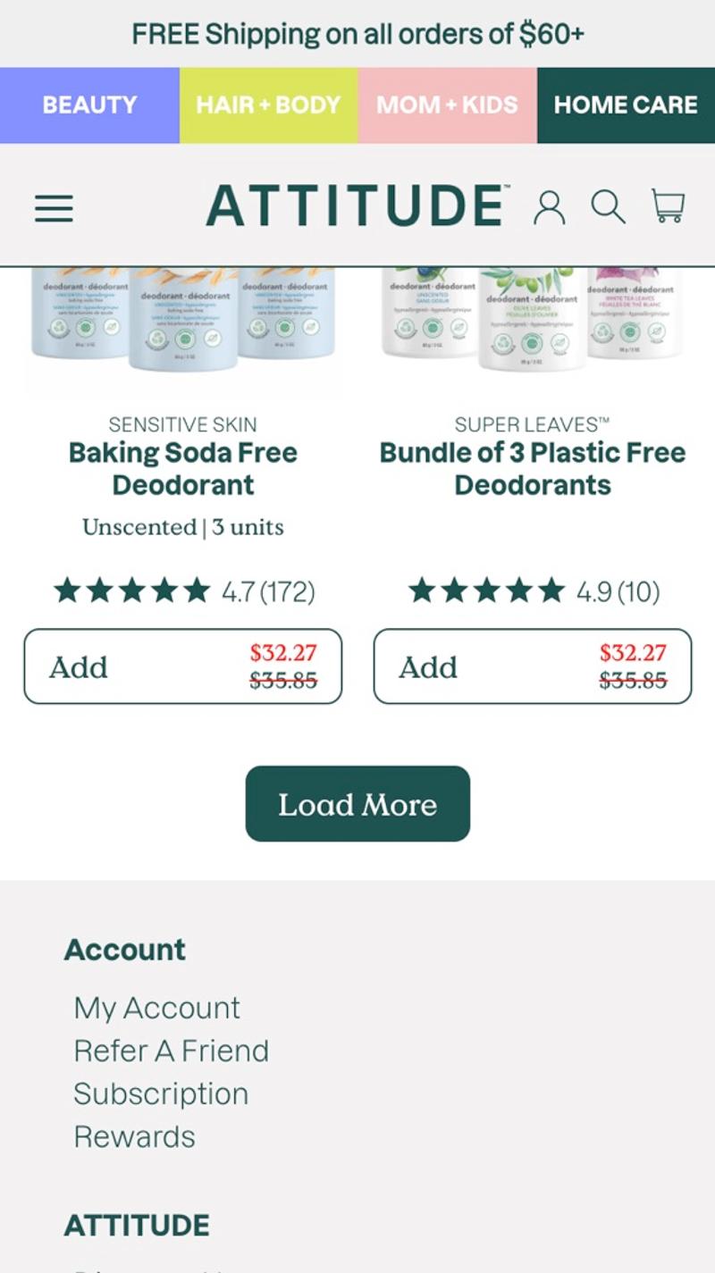
- Attitude: This webshop has a design in which two products are displayed side by side on a mobile screen. The reviews are also made visible directly on the PLP. It is striking that one button is chosen per item, but these are then shown without a background color.
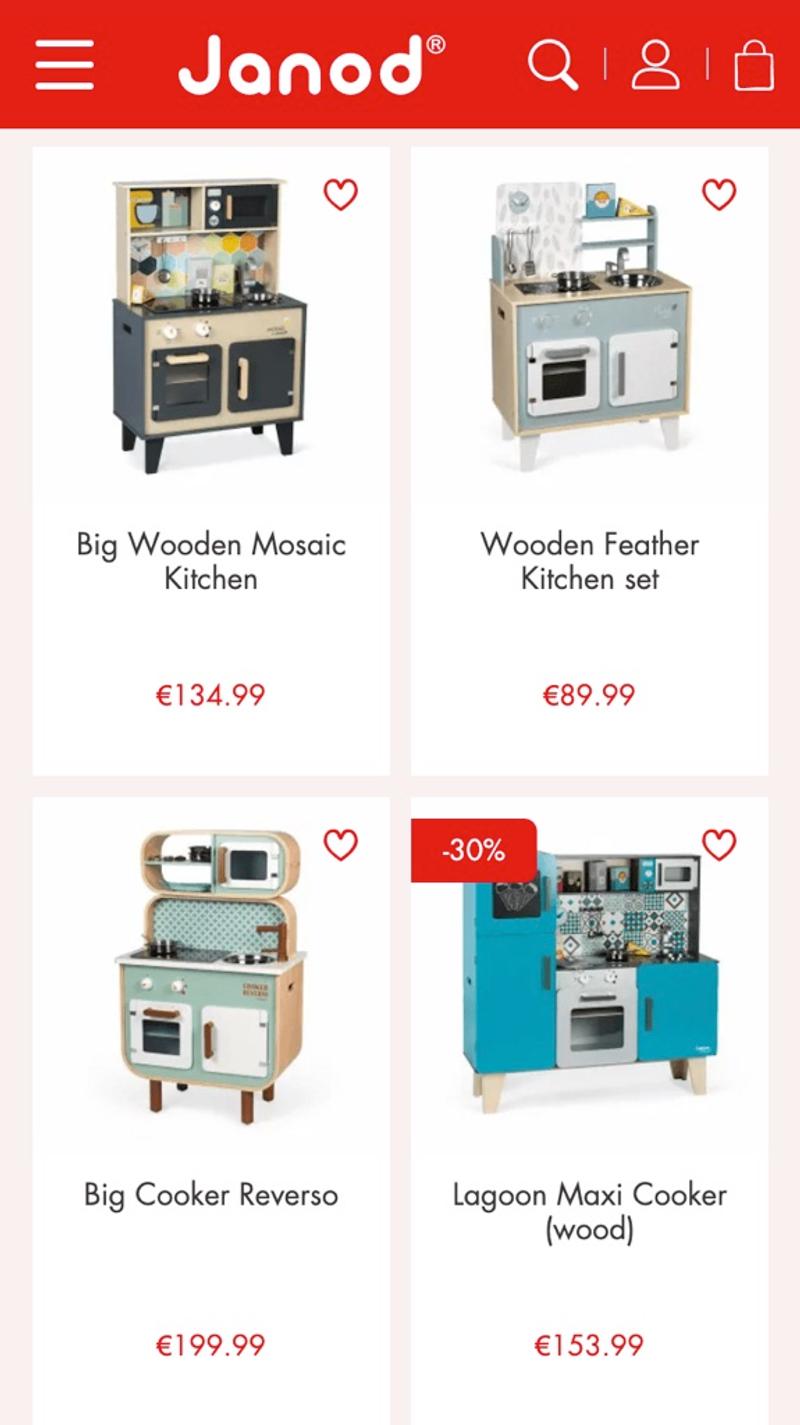
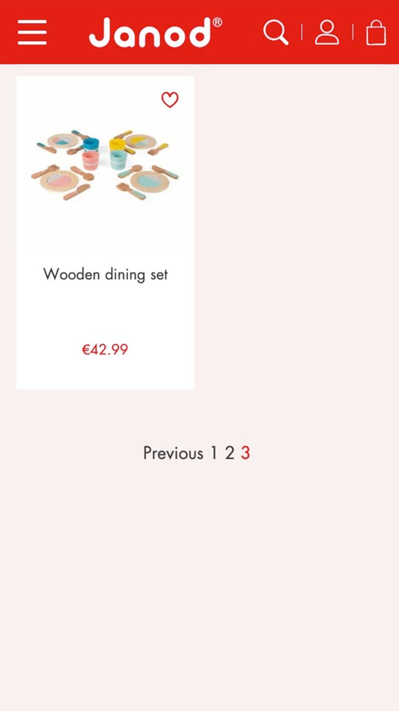
- Janod: Here the products are shown with little information per item. However, a favorite heart is immediately shown. In theory, visitors can save their favorite items from multiple categories and then access them from their wish list.
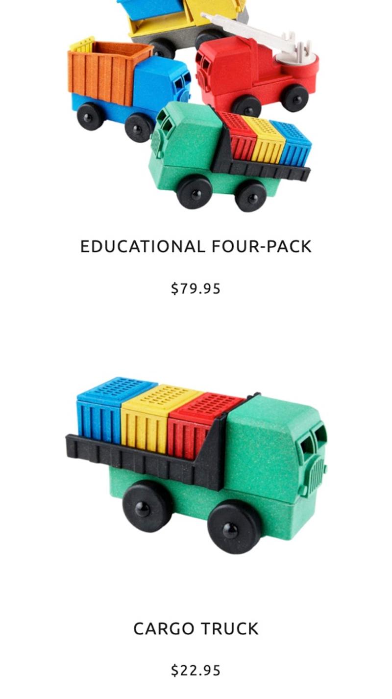
- Luke's Toy Factory: A striking feature of this website is the choice not to work with an edge, shadow, or background color. The products are now listed below each other with prices. This can make it difficult to visually determine which information belongs to which. You now also force the visitor to click through to the product page for each item if they want to read more information about it.
Pagination
Introduction
Many categories contain dozens or even hundreds of products. If these are all loaded at the same time, this can have negative effects on the loading speed of the page. This is why most web shops choose to initially show a limited number of products. Then a solution such as pages (also called pagination or pagination) is used to allow visitors to view the other items.
Best practices
When you initially load more products, visitors need fewer page views to view a certain number of items. However, this larger number of items then takes more loading time. Solutions to this could, for example, be a so-called 'Load more' button. You show such a button below the first set of results, after which a new set of results immediately becomes visible (without reloading the page). With these types of solutions, it is important to take search engine optimization (SEO) into account. After all, you have to ensure that search engines can easily find all products and that they are not hidden behind the JavaScript logic of the 'Load more' button. A third option can be to work with a so-called scroll forever setup. This is similar to a 'Load more' button, but instead of clicking the button, new products automatically load when a visitor reaches the end of the first set of products. The challenge with this solution, however, is that it becomes virtually impossible for visitors to reach the footer of the website. If important information is shown there, this may not be the best solution to display the products.
Measuring
Pagination in all the forms described is relatively easy to measure. Depending on the chosen solution, this is best done using visitor behavior analysis tools (such as Hotjar) or web analysis tools. Once you have a good understanding of how many visitors make it past the first set of results, you may be able to use those learnings to optimize things like sort order. It may also be more effective to show a different number of products per page.
Alternatives
In addition to the usual pages, you can work with a 'Load more' button or scroll forever setup. There are also websites that choose to only show a 'Previous page' and 'Next page' button. This can be a mobile-friendly solution, especially for web shops with relatively few products.
Validating
Validating the most suitable solution can be challenging. In a sense, each category page is unique because different (types of) products are shown on it. You should also take into account the chosen order in which the products are sorted and the extent to which filters have been applied. Presumably A/B testing is the best solution in this case. Keep in mind that not all visitors see the pagination because it is located at the bottom of the page.
Personalization
For visitors who regularly use pagination, you might consider increasing the number of products per 'page'. This way you ensure that these visitors encounter more items without requiring additional interaction from the visitor.
Examples
- Attitude: Here a 'Load more' button is chosen. As soon as this is clicked, more products will be shown. It is important that the page does not jump up when the button is clicked, but the items neatly appear on the screen instead of the button.
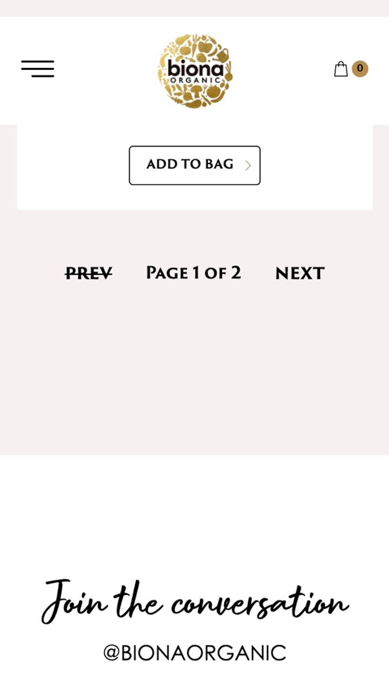
- Biona: A design with two buttons and text to indicate which page a visitor is on. This can be effective, especially with a small number of pages. However, when the number of pages increases, it will become difficult for visitors to find a specific item. For example, going from page 3 to page 16 takes a large number of clicks on this page.
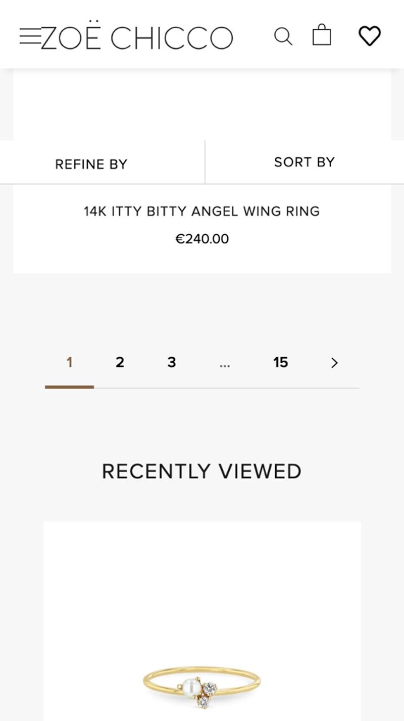
- Zoë Chicco: This online store chooses a traditional design with clickable page numbers. In this way, it becomes clear to visitors approximately how many products there are in total and it becomes possible to jump between pages.
- Janod: Page numbers are also used in this webshop. In this case, however, a 'Previous' and 'Next' button is also shown. It is important to note about this webshop that the tap target of this page is very small, which can make it difficult to press the correct number with your finger.


