The checkout is the last part of the conversion funnel. This page type is also called 'order street' or 'checkout'. The purpose of these pages is to complete the order. Data is collected from visitors that are necessary to deliver the products, such as a name, address, delivery time and payment method.
In ecommerce web shops, the checkout almost always follows the shopping cart. However, with some CMS systems it is also possible to direct visitors to the checkout, for example via a link from an email. Visitors who are in the checkout have a high chance of converting. Which parts offer the most potential for optimization? What can you do to validate those changes? And what are other online shops doing?
Progress
Introduction
A progress indicator is usually shown at the top of the pages in the checkout funnel. This element ensures that the visitor knows which steps the checkout funnel consists of and where he or she is now. This creates a feeling of control.
Best practices
The vast majority of web shops opt for a horizontal representation of the steps. A line is often shown with dots or icons on it that indicate the individual steps. In many cases, completed steps are highlighted and text indicates what the steps are.
Measuring
In a broader sense, it is important to know at which steps visitors drop out of the funnel. However, you cannot measure this directly based on the progress indicator. What you can measure is which steps visitors click on and from which steps they do so. For example, do visitors often jump back from the 'Summary' step to the 'Personal information' step? Then you can start investigating this.
Alternatives
There is a lot of variation possible in how you design your progress indicator. For example, there are parties that fold rounded steps for mobile screens. Some web shops also opt for a nice, relevant animation or icons as a design. In addition, you can decide whether or not to allow jumping between steps within the checkout funnel.
Validating
There are several ways to validate changes in the progress indicator. For example, you can conduct quantitative research through visitor behavior analyzes (especially session recordings), web analysis, or AB testing. In terms of quality, user testing is probably the best solution. Combinations of different research methods will probably lead to the best validation.
Personalization
I do not immediately see any possibilities for personalization at the level of visitors. However, a webshop can personalize the experience by, for example, using unique icons or subtle animations. Keep in mind that the experience remains intuitive and clear for visitors.
Examples
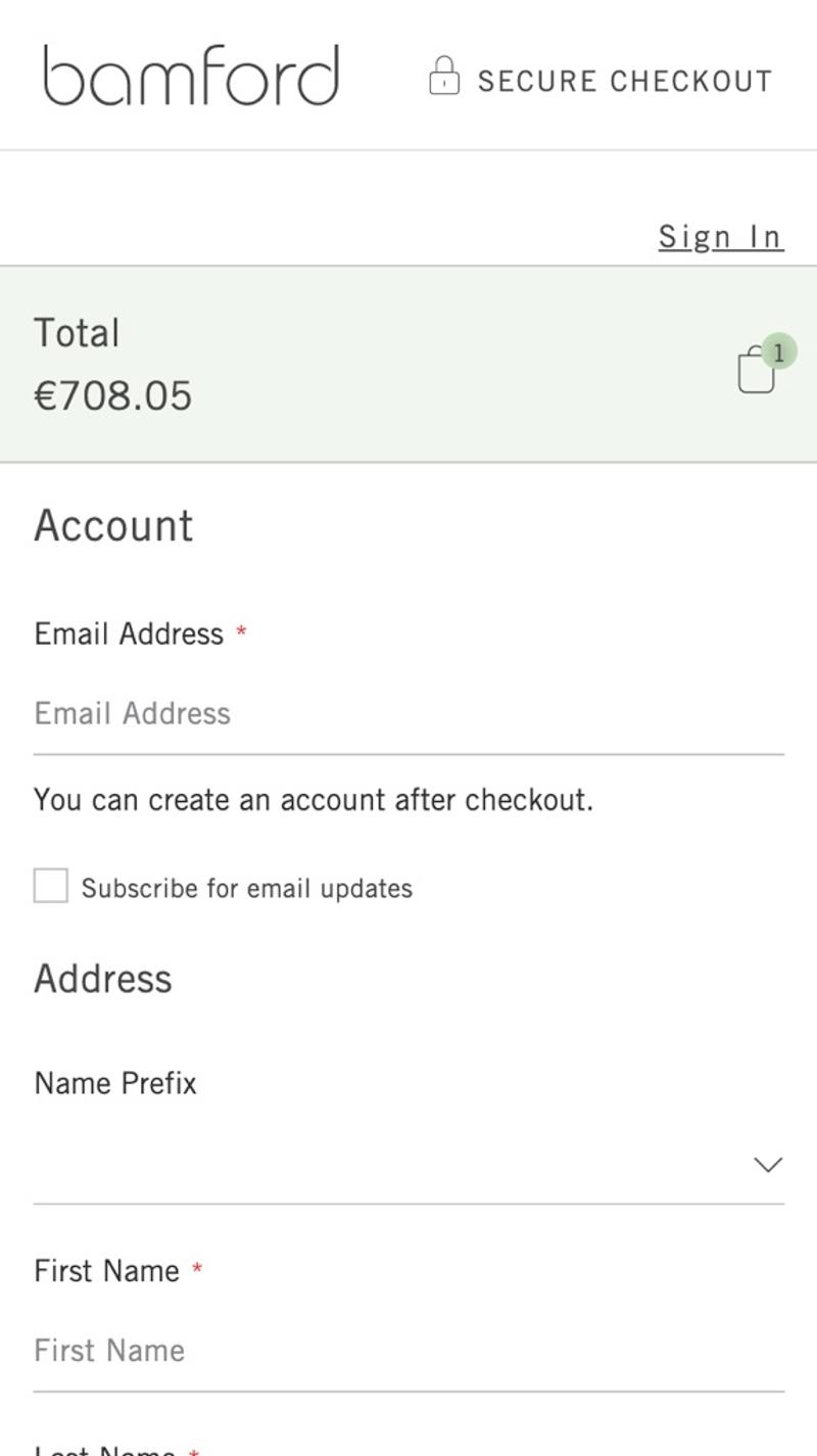
- Bamford: This webshop chooses not to show a progress indicator at all. This ensures that visitors have no overview of the number of steps they still have to take or how far they have already gone. Even with a so-called one-page checkout, you could still think about a progress system, purely to give visitors an additional sense of control.
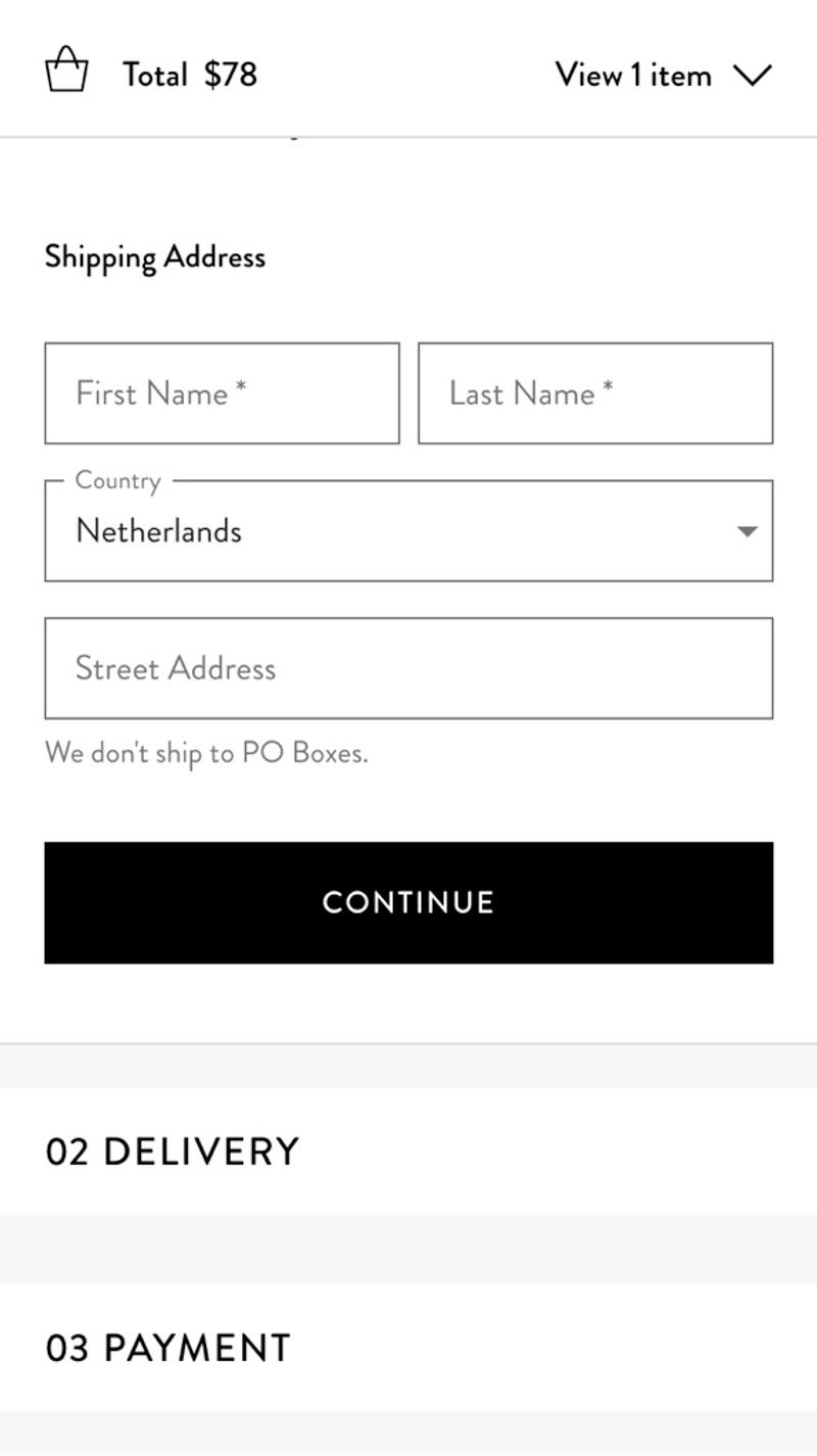
- Mejuri: Here the progress is shown in the form of numbered blocks in which the different steps are hidden. Because these blocks are initially collapsed, you as a visitor can, as it were, look ahead and see how much you still have to do.
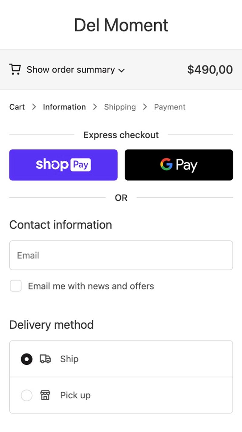
- Del Moment: Instead of working with a horizontal line, the progress indicator is shown here as simple text. This design is minimally distracting and at the same time gives a clear idea of the checkout process.
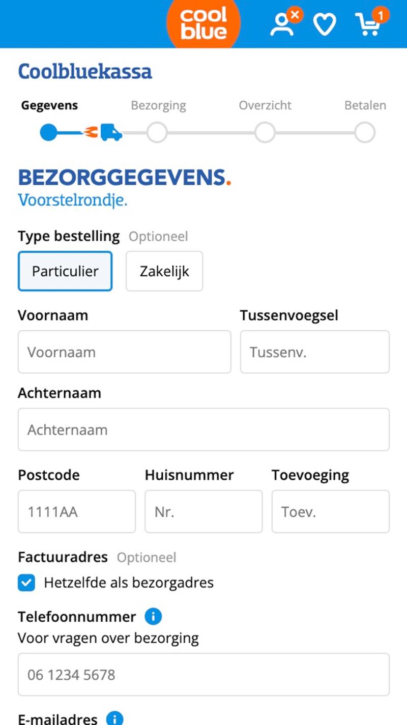
- Coolblue: The car that is used animates towards the next step when you have reached it. This gives visitors a feeling of 'progress' and fits perfectly with the company's motto "Everything for a smile".
Free and non-binding 1 hour session?
Gain insight into your challenges surrounding CRO
Forms
Introduction
Forms are a critical part of the customer journey. This part is often underestimated by web shops, resulting in forms that frustrate visitors and cause them to drop out.
Best practices
The advice is to show as few form fields as possible, while of course still retrieving all necessary data. Use clear labels that also remain visible on mobile devices while the data has been entered in the field. In addition, it often helps to explain privacy-sensitive fields such as an email address or telephone number. A sufficiently large font ensures that mobile browsers do not zoom in. Finally, it should be clear to visitors which fields are mandatory and which are optional.
Measuring
Because there is so much interaction with the fields, you can measure a lot. For example, consider how many seconds visitors spend on each field, which fields cause error messages, and which fields cause visitors to leave the page. All this information can provide very valuable insights into the checkout conversion optimization opportunities.
Alternatives
The possibilities for varying forms are endless. For example, you can display labels in various ways, you can design borders around form fields in various ways, and there is room for maneuver in the introductory text above the form. The only real alternative to forms in the checkout would be to handle all sales by telephone, but this seems a pointless solution for an average ecommerce webshop.
Validating
The most important methods to validate optimizations at the checkout are usability testing and A/B testing. Visitor behavior analysis is less interesting because the thoughts behind what visitors think of the forms can provide added value. Because the conversion rate of visitors who are already in the checkout is very high, A/B tests with less traffic can still produce significant results in comparison.
Personalization
For returning visitors, it can be extremely valuable to fill out some form fields for them. This way they can go through the checkout much faster, which will have a positive effect on the conversion rate.
Examples
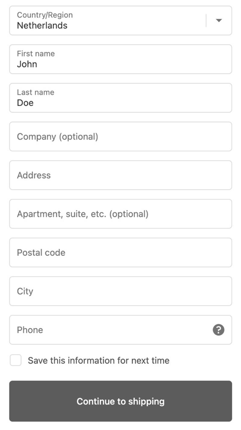
- Arloe: Neat, clear form fields are shown here. On mobile they span the full width of the screen and have borders around the entire field. Labels are initially shown in the field and then move to the top of the field. However, there is no indication of which fields are mandatory or optional.
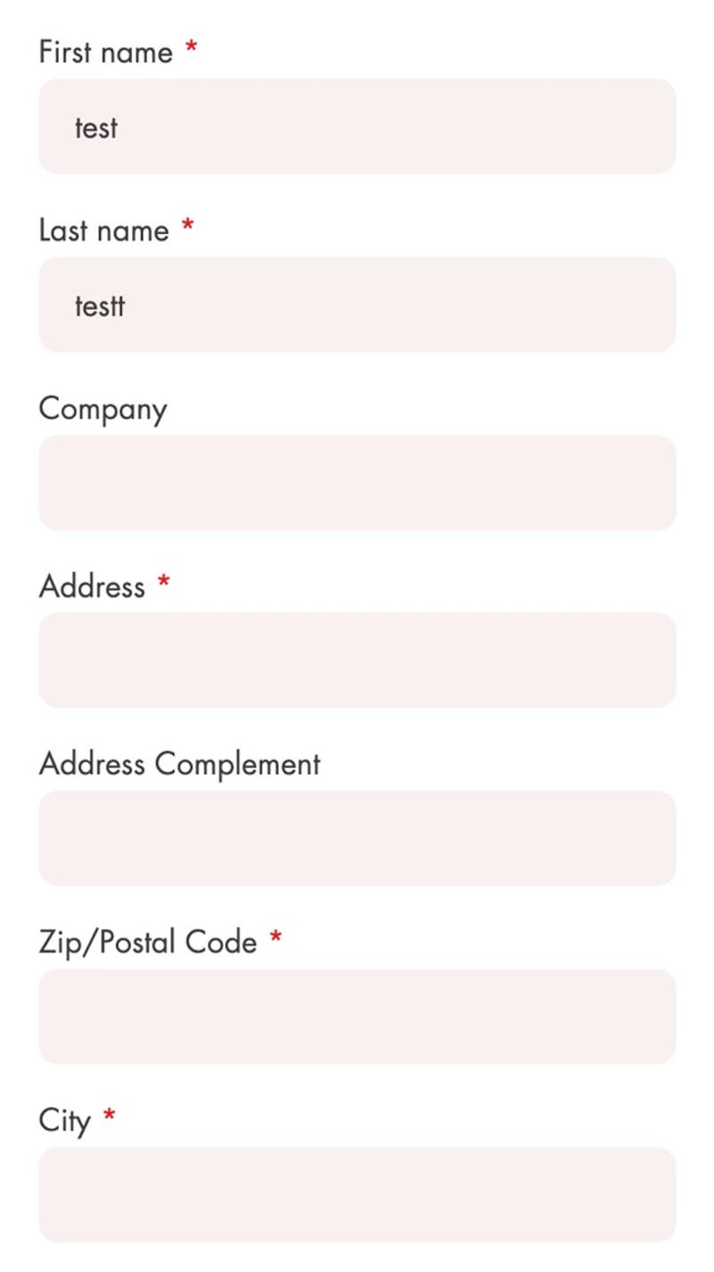
- Janod: The lack of borders around the fields makes the whole graphic less clear. In contrast, the labels above the fields help provide separation between the requested data. In this case, mandatory fields are indicated using a red asterisk.
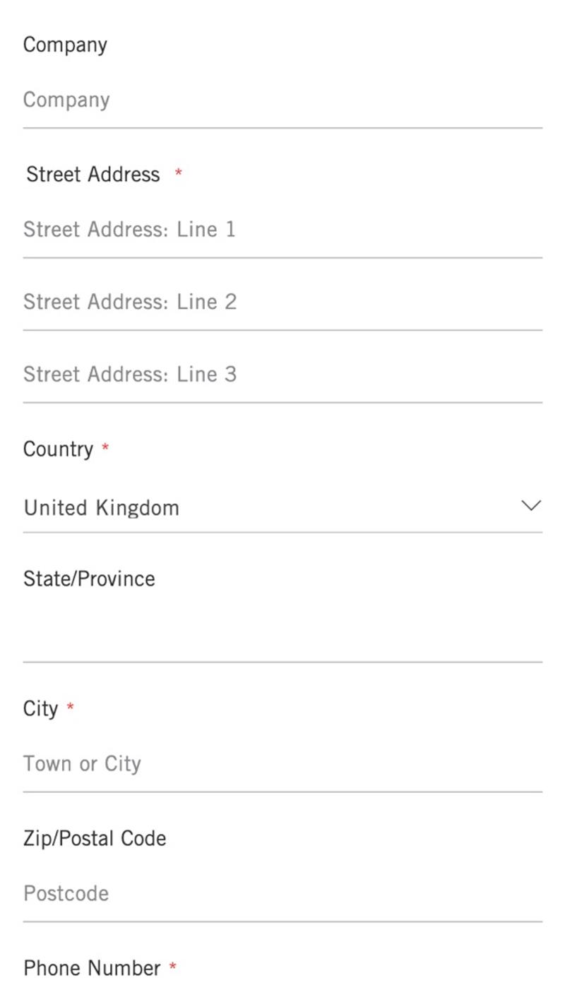
- Bamford: This webshop works with a combination of labels and placeholders. Unfortunately, it is only possible to use an edge under the field, which makes it difficult to get a good overview of the fields. The contrast of the placeholders in the input fields is also on the low side.
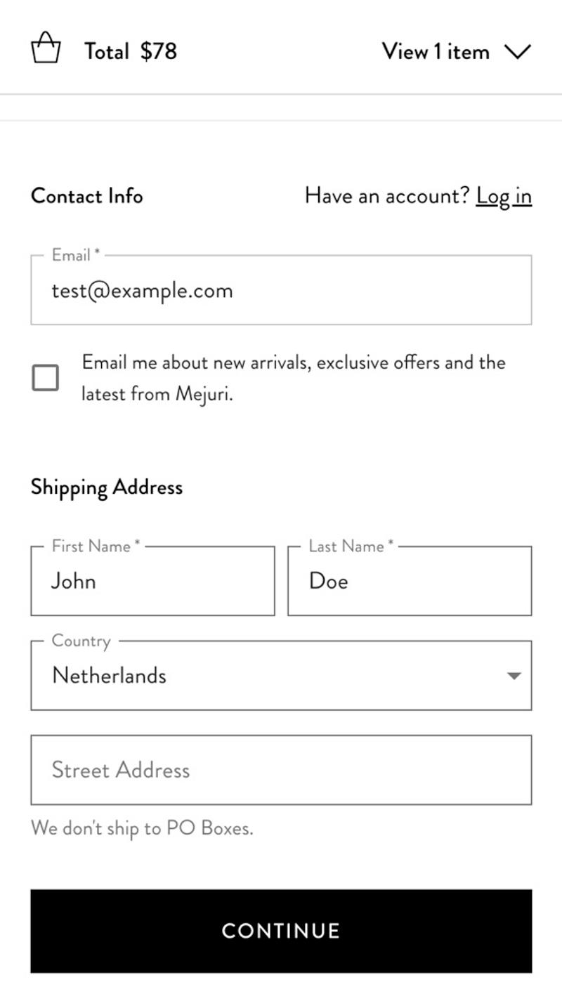
- Mejuri: In this game, the label of completed fields is, as it were, placed at the edge of the field. This makes it extra clear what has been entered in a field and at the same time what the label of the field is.
Shipping
Introduction
Almost physical products ordered from an online shop will have to be shipped somewhere. This could, for example, be a house or a pick-up point. Each of these available options often has different advantages and disadvantages for the visitor.
Best practices
It is advisable to offer visitors some options regarding shipping options. Consider, for example, differences in delivery dates, delivery locations, and degree of sustainability. If the costs per option are also shown, visitors can make a well-considered choice for a particular shipping option.
Measuring
Every visitor chooses a certain shipping method. In some cases this will be the default method selected and in other cases a different method will be actively selected. Storing this data can contribute to a better checkout experience for visitors. You can then select popular shipping methods in a broad sense (for a specific country, type of products, or region) as standard.
Alternatives
Some webshops choose to offer shipping options in the shopping cart. Personally, I find this confusing, because in many cases visitors are still collecting items and are not yet ready to make the actual purchase. You can also vary how many different types of shipping options you offer to visitors.
Validating
Shipping options lend themselves well to validation through surveys. You can ask visitors to what extent they would be open to alternative shipping options such as sustainable shipping, paying extra for evening delivery, or same-day delivery. Although this type of research must always take the value-action gap into account, it can potentially yield valuable hypotheses for optimizing the checkout. You can then test those hypotheses using A/B testing when you receive sufficient orders per day.
Personalization
Shipping options can be personalized based on information such as order history, country, or selected products. For example, you could consider highlighting a sustainable shipping method for visitors who have sustainable items in their shopping cart. Another option for returning visitors is to select the shipping method they chose for previous orders as standard.
Examples
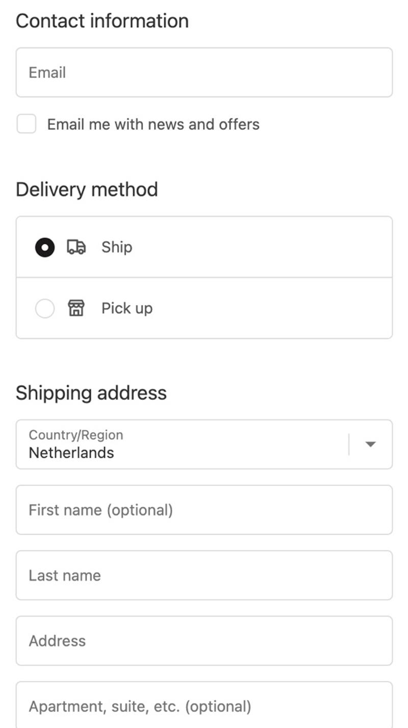
- Del Moment: Only two options are initially shown here, namely delivery to a location or collection at a pick-up point. This low number of options prevents possible choice stress, which could result in fewer visitors abandoning this choice.
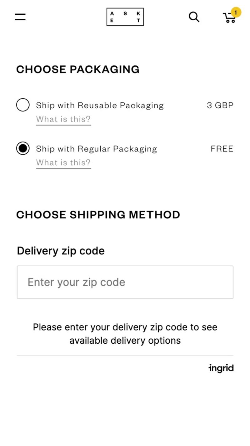
- Asket: This website offers the option to view the available shipping options based on an entered zip code. This way, no irrelevant options are shown and as a webshop you have already collected the zip code.
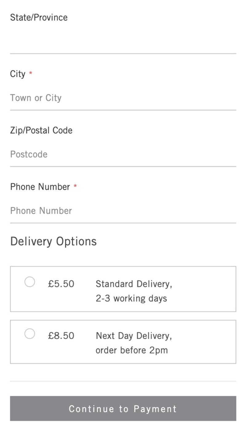
- Bamford: The focus in terms of shipping options in this webshop is mainly on the delivery time. Visitors can opt for faster delivery if they are willing to pay higher costs.
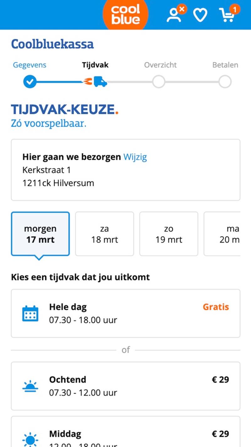
- Coolblue: Multiple choices can be made during this checkout. This way you can first select the delivery date and then also the time period in which delivery will take place. By clearly indicating the costs per option, the choice is made easier for the visitor.


